Sunday, April 28, 2013

Chart of the Day: Corporate Profits vs the S&P 500

Chart of the Day: Corporate Profits vs the S&P 500

I've made a big fuss over QE in recent years and yet the market continues to plough higher.  I often have people ask me:

"Why does QE make stock prices go higher if there's no fundamental impact?"

My answer is always the same.  First, look at Europe where QE has also been implemented and stock markets like Greece, Italy and Spain have been decimated.  Then look at a country like the USA where QE has been implemented and yet stocks soar.  Then ask yourself what the big difference is between these countries?  The answer: austerity versus massive deficit spending.

It might be easy to scoff at such an observation, but the reality of the picture is that corporate profits have been largely driven by the deficit in this cycle.  As net investment collapsed the traditional driver of profits was overtaken by government spending (see figure 1).  This makes sense if you're familiar with Kalecki and his profits equation.  It makes even more sense if you'd been working under Richard Koo's balance sheet recession theory in recent years.  The impact of government deficit spending in such an environment has been massive.  All those people screaming about the ill effects of deficit spending and hyperinflation in recent years missed the very explainable and fundamental driver of the profits momentum.

This doesn't mean QE did nothing (I think it helped to some degree), but it doesn't mean it was the primary driver of the recovery by any means.  In fact, the risk of QE is the disequilirbium I often talk of where market become disjointed when compared to profits.  And when people ask me if QE is resulting in some disequilibrium, I often tell them that it hasn't necessarily resulted in that outcome yet.  But with stocks rising nearly every day and soon outpacing the trajectory of corporate profits (see figure 2) there's no reason to think that we can't reach a level of disequilibrium in the next few years (or maybe even less).

mm1

(Figure 1 – Corporate Profits Breakdown via Orcam Investment Research)

cp

(Figure 2 – Corporate Profits vs S&P 500)


Sent from my iPhone

Thursday, April 25, 2013

When the Government Debits Our Bank Accounts….

When the Government Debits Our Bank Accounts….

I woke up to a not so lovely email this morning:

"There has been a large withdrawal from your bank account".

I won't joke around about what "large" is in my world because it's probably "small" in many other people's worlds, but that's beside the point.  The point is, that withdrawal was part of a very necessary flow of funds that precedes government spending.  After all, it was the US Treasury debiting my bank account.  Those of you who understand Monetary Realism know how important it is to understand the flow of funds in the economy.  The flow is the lifeblood.  It keeps revenues going, incomes going, spending going, etc.  No flow, no economy.  It's that simple.

The interesting part of the withdrawal I noticed this morning is that the government doesn't really need to withdraw money in order to be able to spend.  After all, it has deemed the US dollar as the unit of account in the USA and can create currency at will.  In theory, our government could just print dollar bills right into our bank accounts.  This was the true message of the Trillion Dollar Coin discussions.  Unfortunately, most commentators didn't even understand that.  Our government, if it wanted to, could just start crediting bank accounts without procuring the funds first.

But what really happens is due to specific bank centric design.  Our government has essentially outsourced the money supply to private banks.  So money creation starts when a bank makes a loan and money destruction occurs when a bank loan is repaid.  Between this start and finish are nothing more than a sequence of flows.

So, when the government taxes Peter they debit Peter's bank money (what Monteary Realism calls "inside money" because it comes from inside the private banking system), resulting in a credit to the government bank account so they can then debit the account and credit someone's account with inside money via government spending.  If they don't procure enough inside money they will sell bonds and again use the inside money system as an intermediary.  That is, if Peter buys a t-bond the government debits his inside money account, credits their account, credits Peter's account with a t-bond, and will eventually debit their account so they can credit someone else's account via government spending (notice the government doesn't "print money" when it taxes or sells bonds!).

As you can see, there's a specific flow of inside money that occurs.  Why?  Because the whole system is built around the stability of the inside money system.  It's all a flow of funds occurring in inside money and understanding that flow is crucial to understanding the modern monetary system.

* To learn more please see the following:

1.  Understanding The Modern Monetary System

2.  Understanding Inside & Outside Money

3.  Understanding Moneyness

4.  The Disaggregation of Credit


Sent from my iPad

On the virtuous circle of exporting deflation | FT Alphaville

On the virtuous circle of exporting deflation

We thought the following from TD Securities' Richard Gilhooly on Tuesday was a rather insightful way of looking at the whole BoJ effect (our emphasis):

While it remains a contentious point and as yet unproven, Japan's devaluation and soaring Nikkei vs slumping DAX or Bovespa has all the hallmarks of a competitive devaluation. While competing factions debate the Monetary expansion/QQE, versus beggar-thy-neighbour interpretation, one positive aspect of the Japanese Yen collapse and fear of exported deflation has been collapsing commodity prices with weak growth in export countries (China, Germany, S Korea) and a stronger USD helping a supply story (crude inventories at 22yr highs) and weak demand send commodities into a bear market.

The silver lining is that the collapse in inflation expectations may actually provide Germany/ECB with a motive to print to fight deflation and maybe even allow the Fed to print more and expand QE, versus expectations of tapering just 2 weeks ago with the minutes. The equity markets are again high on the sniff of QE adrenalin ahead of the FOMC and ECB next week, and the BOJ this Friday.

While the circularity of this argument is enough to make one's head spin, it appears for now to be a virtuous circle with rising equity prices emanating from slumping commodities. We argued last week that the drop in Gold prices was not bad for stocks and that the relationship is inverse and showed the inverse correlation since last November, falling Gold, surging stocks.

Volatility, we argued was the only reason for the short term positive correlation that lasted but 4 days. TIPs have seen a partial retracement of around 10bpp in b/es after a 30-40bp drop and more QE would appear to be a function of inflation (falling) rather than jobs (tapering) as long as the U/E rate is well over 6.5% and maybe even below if inflation remains 'dangerously' low.

Not that it is really dangerous, as displayed by the equity markets, but that the Central Bank-speak that allowed QE2 in 2010 to address that perilous risk. The upshot to all this is that stocks can't go down and probably go much higher (AAPL after hours) while $/Yen has quickly rebounded and probably breaks 100 this time, leaving bonds nowhere to go but down as today's reversal would indicate. Should a deflationary spiral materialise, which would only come after policies are deemed ineffective or inflation keeps falling to levels that are dangerous, then bonds might rally strongly, but this could only happen with cash flowing OUT of equities. Tomorrow's 5yr note auction is a good opportunity to buy 5s against bonds and a close over 220.5bp on 5-30s would strongly support this view.

The logic of the above is beautifully simple. Not that it's not been said before, but this really gets to the point we feel.

There is a stealth war on to export deflation, ideally in a way that simultaneously imports or steals inflation from elsewhere.

In some ways, it was the US which began the whole thing by inadvertently importing deflation from China over the 90s and naughties and without even realising it. And in so doing, it spread its growth effect to China.

Japan meanwhile has been trying to export its deflation for decades, with varying success. It is in some ways the original Patient Zero. The deflation it managed to export, however, has now created something of a zero sum game because it has led to other countries being forced to repel deflation in similar ways.

Consequently, we have left behind the world in which one man's deflation is another man's inflation. There is very little naturally occurring growth (the sort with good inflation) in the developed world left to capture.

There is of course a lot still left in the emerging market — but that unfortunately still has risk.

Before that risk is reduced the developed world has to reach such a point of wealth parity, that a united endeavour to spread wealth to the still risky areas of the world finally begins to make sense. That is, you get to the proverbial "nothing to lose" stage.

In the meantime, we continue the process of competitive devaluations and stimuli, which while being openly criticised by those with savings to be diluted, are more akin to a virtuous circle due to the wealth distribution effect they bring with it. This is because such easing efforts ensure the deflationary shock is diluted one country at a time, and that hoarded demand stubbornly held back elsewhere is tempted out, until something of a happy parity is reached amongst all. This is indeed something that's equivalent to a global stock dilution effect.

(In some ways, that was what Soros' idea to expand the global SDR allocation back in 2009 was all about.)

But as with all competitive devaluations/stimuli/deflation exports it now all depends on how the next most affected party responds. In the latest BoJ round it's clear that party is Germany, Japan's most obvious and natural competitor. Japan's current gain is understandably Germany's loss.

The question is will Germany overcome its totally unjustified inflation paranoia and act to counter the disadvantage?

If it doesn't the virtuous circle stands to collapse with Germany. In the first instance, that might not be a bad thing for Europe, because a German weakness only makes the periphery look more competitive and strong.

Everything after all is relative.

That said, we're not quite sure how good it would be for Europe in the long term, because even the periphery can't compete internationally if the euro is too strong.

Related links:
Japan 2.0 (and that's a target, mind) - FT Alphaville
In defence of sterling – FT Alphaville


Sent from my iPhone

Sunday, April 14, 2013

PRAGMATIC CAPITALISMChart of the Day: Corporate Profits vs the S&P 500 - PRAGMATIC CAPITALISM

Chart of the Day: Corporate Profits vs the S&P 500

I've made a big fuss over QE in recent years and yet the market continues to plough higher.  I often have people ask me:

"Why does QE make stock prices go higher if there's no fundamental impact?"

My answer is always the same.  First, look at Europe where QE has also been implemented and stock markets like Greece, Italy and Spain have been decimated.  Then look at a country like the USA where QE has been implemented and yet stocks soar.  Then ask yourself what the big difference is between these countries?  The answer: austerity versus massive deficit spending.

It might be easy to scoff at such an observation, but the reality of the picture is that corporate profits have been largely driven by the deficit in this cycle.  As net investment collapsed the traditional driver of profits was overtaken by government spending (see figure 1).  This makes sense if you're familiar with Kalecki and his profits equation.  It makes even more sense if you'd been working under Richard Koo's balance sheet recession theory in recent years.  The impact of government deficit spending in such an environment has been massive.  All those people screaming about the ill effects of deficit spending and hyperinflation in recent years missed the very explainable and fundamental driver of the profits momentum.

This doesn't mean QE did nothing (I think it helped to some degree), but it doesn't mean it was the primary driver of the recovery by any means.  In fact, the risk of QE is the disequilirbium I often talk of where market become disjointed when compared to profits.  And when people ask me if QE is resulting in some disequilibrium, I often tell them that it hasn't necessarily resulted in that outcome yet.  But with stocks rising nearly every day and soon outpacing the trajectory of corporate profits (see figure 2) there's no reason to think that we can't reach a level of disequilibrium in the next few years (or maybe even less).

mm1 Chart of the Day: Corporate Profits vs the S&P 500

(Figure 1 – Corporate Profits Breakdown via Orcam Investment Research)

cp Chart of the Day: Corporate Profits vs the S&P 500

(Figure 2 – Corporate Profits vs S&P 500)


Sent from my iPad

PRAGMATIC CAPITALISMHatzius: The Deficit Will Decline Substantially in the Coming Years - PRAGMATIC CAPITALISM

Hatzius: The Deficit Will Decline Substantially in the Coming Years

Jan Hatzius of Goldman Sachs had some interesting commentary on the deficit the other day.  You'll recognize the sectoral balances chart in his work as he's one of the few analysts on Wall Street who seems to really appreciate the importance of Wynne Godley's work.

Here, he describes the 3 reasons why the deficit is about to slide in the coming years:

Orcam ad4 Hatzius: The Deficit Will Decline Substantially in the Coming Years

"There are three main reasons for the sharp reduction in the deficit:

1. Lower spending. On a 12-month average basis, federal outlays have fallen by a total of 4% in the past two years, the first decline in nominal dollar terms over a comparable period since the demobilization from the Korean War in the mid-1950s.

2. Higher tax rates. The increase in payroll tax rates in January 2013 has boosted federal receipts by around $120 billion (annualized), or about 0.8% of GDP.

3. Economic improvement. Although real GDP has only grown at a sluggish 2%-2.5% pace since the end of the 2007-2009 recession, this has been enough to generate a sizable improvement in tax receipts, over and above the more recent impact of higher tax rates. Even prior to the tax hike that took effect in early 2013, total federal receipts had grown by 7% (annualized) from the 2009 bottom, nearly twice the growth rate of nominal GDP.

We expect the deficit to continue to decline and are forecasting a deficit of 3% of GDP or less in fiscal 2015. Some of this is policy-related. Sequestration has barely started to show up in the outlay data, and the expiration of the Bush tax cuts for high income earners in 2013 is likely to reduce tax refunds and boost final settlements in early 2014. In addition, the two parties are calling for further spending cuts and/or tax increases (although it is unclear whether these will be enacted).

But the more important reason, in our view, is that there is still a great deal of room for the economic recovery to reduce the deficit for cyclical reasons. The key to this forecast is our expectation that the private sector financial surplus–the difference between the total income and total spending of all households and businesses–will decline substantially further from the 5.5% of GDP reading of the fourth quarter of 2012 toward the historical average of 2% of GDP.

As a matter of accounting, this reduction must be mirrored in a drop in the federal deficit, a drop in the state and local deficit, an increase in the current account deficit, or a combination of all three. In practice, however, we expect it to translate primarily into a decline in the federal deficit, as tax receipts rise and outlays decline (e.g. via reductions in the unemployment rolls.) This expectation is consistent with the historical record. As shown in Exhibit 2, there has been a close inverse relationship between the private sector balance and the federal government balance in recent decades, with a correlation in annual data of -0.72.

gs1 Hatzius: The Deficit Will Decline Substantially in the Coming Years

And the conclusion from Hatzius:

"In our view, the most important implication from the reduction in the budget deficit for the near-term economic outlook is reduced pressure for further fiscal retrenchment. Partly for this reason, we expect the drag from fiscal policy on real GDP growth to decline sharply from around 2% of GDP in 2013 to around 0.5% in coming years. This is a key reason for our expectation that real GDP growth will accelerate from around 2% (annualized) in Q2/Q3 2013 to 3%-3.5% in 2014-2016."

I'd only add that it's important that the private sector's de-leveraging is slowing and even turning into a re-leveraging to some degree.  This means the private sector is healthier than most presume and that the government deficit isn't needed to power private growth as much as it has been in the last few years.  This passing of the baton is important in understanding the future trajectory of the economy.  The decline in the deficit is as much as a result of mild government austerity as it is a sign of increased private sector health.


Sent from my iPad

Calafia Beach Pundit: Stocks and bonds are not at odds with each other

Stocks and bonds are not at odds with each other

I'm seeing more and more observers commenting on the apparent disconnect between the stock and bond markets. Reader "Rob" recently linked to a post by Thomas Kee at Smart Money that is typical. Kee argues that bond buyers these days are likely smarter than equity investors, because "they are educated and intelligent, and they make decisions for longer-term purposes." Whereas equity investors are more short-term focused ("fast money") and currently have been lulled into believing the recovery is real, when in fact it is "fabricated."

I think it's very difficult to defend the belief that one class of investors (bond buyers) see the world differently than another class (equity buyers), when both operate in the same capital market and both have access to the same information. To assert this, however, I need to show how it is that bond and equity investors today share similar beliefs about the economic fundamentals. If I'm right, then the "disconnect" is not really a disconnect, it's simply the result of how two very different asset classes react to the same information.


The chart above is a good illustration of the alleged "disconnect" between the stock and bond markets. Over the past three years, stock prices have been in a rising trend, while bond yields have been in a falling trend. That doesn't make sense, so the thinking goes, because falling bond yields are symptomatic of a market that is increasingly risk-averse, whereas rising equity prices are symptomatic of a market that is increasingly risk-loving. I think both interpretations are wrong.


As the first chart above shows, there is a decent correlation between the level of real yields and the strength of the economy. Real yields and real economic growth were both quite high in the late 1990s and early 2000s. The economy had been booming for several years, and the market expected this to continue. The real yield on TIPS had to compete with the very strong real yields on equities. This makes perfect sense. Now, over a decade later, real yields on TIPS are negative and the economy is in the midst of its weakest recovery ever, with a so-called "output gap" that could be as much as 13%. As the second chart shows, consumer confidence is extremely low; although it has risen in recent years, it is still at levels that in the past have coincided with recessions. The first chart suggests that the level of real yields is consistent with market expectations of almost zero growth for the next several years.


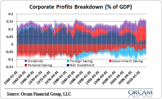
As the chart above shows, the equity risk premium—defined here as the difference between the earnings yield on equities minus the yield on 10-yr Treasuries—is extremely high. Why would the market be indifferent between an almost 5% earnings yield on equities and a paltry 1.7% yield on 10-yr Treasuries? The only explanation that makes sense is that the market has almost no confidence that corporate profits will maintain their current levels; instead, the market fully expects profits to decline significantly.


As the chart above shows, the earnings yield on equities tends to track inversely the real yield on TIPS. In other words, when real yields fall, as they have over the past decade, the earnings yield on equities has risen. The more gloomy the market becomes over the prospects for economic growth, the higher the equity yield that the market demands in compensation for what is expected to be a big decline in profits.  The two lines have diverged of late, and perhaps that is significant, but such divergences have happened before.


As the chart above shows, it is very unusual for the earnings yield on equities to be higher than the yield on BAA corporate bonds. Would you pass us the opportunity to buy stocks with a higher earnings yield than available on corporate bonds if you thought the economy was going to be healthy? No, because that would mean giving up the opportunity for price appreciation. Investors today are willing to accept a lower yield on corporate bonds because bonds are higher in the capital structure and have first claim to earnings, which the market suspects may be in for trouble.


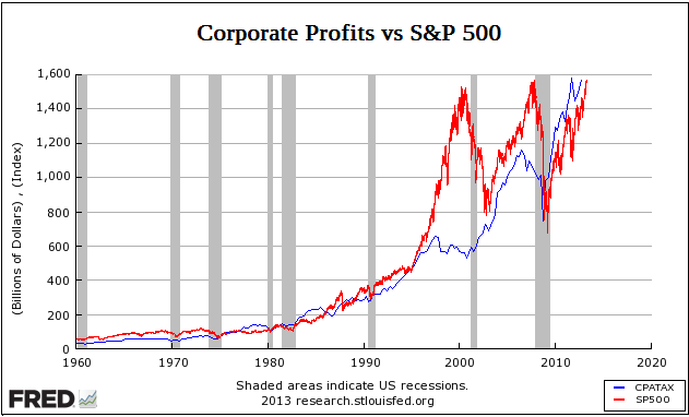
But what about the fact that stock prices are at all-time highs? Doesn't that conflict with the fact that Treasury yields are close to all-time lows? Not necessarily. As the chart above shows, in inflation-adjusted terms the S&P 500 is still almost 25% below its 2000 all-time high. From a long-term perspective, the chart suggests that current equity prices are about "average," having followed a 3% trend growth rate, which happens to be the average real growth rate of the U.S. economy. Moreover, corporate profits today are almost 200% above the levels of late 2000. By these metrics, stocks are not optimistically priced at all. Today's S&P 500 PE ratio is just above 15, which is below its long-term average of 16. Shouldn't PE ratios be much higher than average considering that risk-free discount rates are at all-time lows?

Bonds and stocks are both priced to pessimistic assumptions about the future health of the U.S. economy, no matter how you look at it. And as for the assertion that the recovery has been "fabricated," I refer the reader back to many of my posts which show abundant evidence that many sectors of the economy are posting solid, undeniable growth, beginning with this recent post. This recovery may be the weakest ever, but it is no less real because of it.


Sent from my iPad

As Jerry Brown Touts California In China, Its Citizens Pack Their Bags - Forbes

http://www.forbes.com/sites/daviddavenport/2013/04/11/as-jerry-brown-touts-california-in-china-its-citizens-pack-their-bags/


Sent from my iPhone