Factors from Scratch:
A look back, and forward, at how, when, and why factors work
By Jesse Livermore, Chris Meredith, CFA, and Patrick O'Shaughnessy, CFA May 2018 With a million dollars to invest today, would you rather buy a portfolio of New York City taxi medallions or shares in Uber stock?
When we ask investing audiences this question, the answer is almost always Uber. People tend to think in terms of fundamental growth without also thinking about price. In terms of growth and excitement, Uber has the clear edge. But in this paper we're going to explore how investments of both types—those like taxi medallions that are distressed and deeply out of favor, and those like Uber (recent troubles notwithstanding) with strong growth—can be great investments.
The notion that taxi medallions might be a great investment came to our attention in a conversation with investor Andrew Milgram of Marblegate Asset Management. Everyone's gut reaction to taxi medallions is that they are eventually going to be worthless. This sentiment explains why prices for medallions are drastically lower than they were a few years ago. But if taxis survive and produce future cash flows, they could represent an amazing investment opportunity brought about by the market's overreaction on the downside. Low or negative growth investments can still be great, provided that the price is right. Keep taxi medallions in mind as we discuss value investing.
Despite recent troubles, Uber stock has made many investors rich. It's the quintessential example of a high growth, high momentum company. Growth investing is hard, because price as a multiple of earnings or sales is often too high and unjustified relative to actual future cash flow. But if purchased at the right time, investors can ride growth companies to great returns. The timing is critical, so keep Uber in mind as we discuss both glamour and momentum investing.
The excess returns associated with Value and Momentum result from convergent and divergent processes, respectively. Value stocks are systematically underpriced and gradually converge on their fair value over time. Momentum stocks start out fairly valued or slightly overvalued, and go on to become more overvalued in the short-term, before reverting back. Both styles represent a market mistake that can be captured as alpha.
In this piece, we're going to make all of these points more clear through a unified framework that we've developed to explain how factors work. The piece has four parts:
- Foundations: We begin by presenting our framework for tracking factor indexes and decomposing factor returns.
- Value: We then move on to a deep exploration of the Value factor. We first explain how and why it works. We then discuss its recent underperformance, and whether it can be successfully timed as a factor.
- Momentum: We continue with a deep exploration of the Momentum factor. After explaining how and why it works, we highlight the fascinating ways in which it contrasts with and complements the Value factor. We finish with a discussion of Momentum factor timing.
- Conclusion: In the final section, we summarize our findings, and look to the future.
You'll finish this piece with a deeper understanding of factor investing, and hopefully many new questions.
Laying the Foundations: A Framework for Analyzing Factor Returns
Before we can present the many interesting results that we're going to share with you in this piece, we need to explain the basic technique that we're going to use in the analysis. That technique will have two essential parts: (1) index construction and (2) return decomposition.
Index Construction: We're going to start by building stock indexes for factors. These indexes will model factor strategies in the same way that the S&P 500 models a passive U.S. large cap strategy. Ultimately, we'll have a separate S&P-500-like stock index for the Value factor, the Momentum factor, and every other factor that we analyze.
Return Decomposition: After building these indexes, we're going to parse out, or "decompose", the sources of their returns over time. We're then going to carefully analyze results for those sources in an effort to figure out how the factors work.
In implementing this technique, we're going to run into a problem: turnover. Over time, factor indexes frequently turn over their holdings, replacing existing positions with new ones. When we decompose factor returns, we will need to account for the distorting effects that this turnover can have. We've developed a new method that can account for these effects, and we're going to share it in this opening section. The method is detailed, but understanding it is worth the effort.
Index Construction
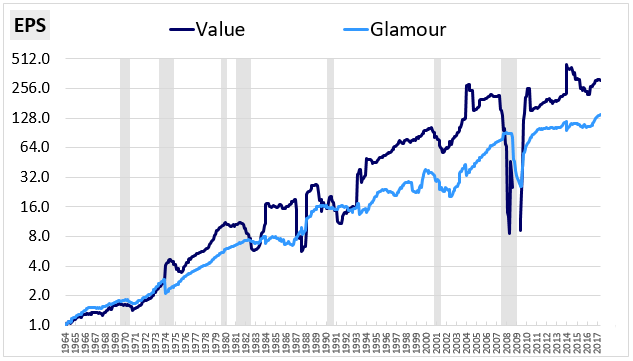
For each factor that we analyze, we're going to represent the factor in the form of an index similar to the S&P 500. Like the S&P 500, our factor indexes will be continuously adjusted for dilution and composition changes, allowing us to track factor fundamentals--earnings, cash flows, sales, and so on--on an aggregate per share basis.
When examining our factor indexes, you'll want to keep three important index features in mind:
- Large Caps Only: We're going to limit our analysis of factor performance to the space of large capitalization stocks only. This approach is conservative because factor returns tend to be much stronger in the mid, small, and micro cap spaces. Any discoveries that we make in the large cap space will tend to apply with even more force down the capitalization range.
- Equal-Weighted: Our factor indexes will be equal-weighted rather than float-weighted or capitalization-weighted. On every index rebalancing date, the positions will be set to the same starting size.
- Full Dividend Reinvestment: Dividends paid by companies in our indexes will be reinvested back into the indexes rather than paid out. The reinvestments will effectively convert dividends into share buybacks spread across the index, where they will show up as growth on a per share basis. This approach will allow us to directly compare the fundamental growth rates of different factor strategies without having to adjust for differences in their payout ratios.
For those seeking more information, we provide a detailed description of the computational methodology that we use to build indexes in Appendix A.
Return Decomposition
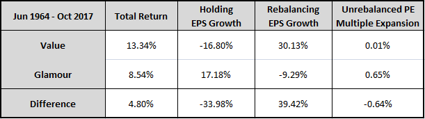
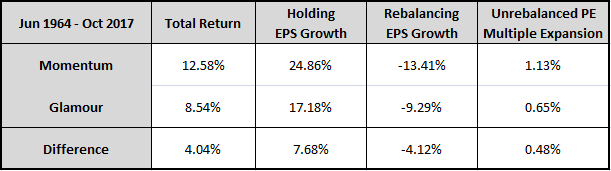
A helpful way to explain return decomposition is with an example. In the tables below, we decompose the returns of the S&P 500 into the sources of dividends, sales growth, profit margin expansion, and price-earnings (PE) multiple expansion.1 Focusing specifically on the period from June 1964 to October 2017, we start by gathering initial and final data for the index:
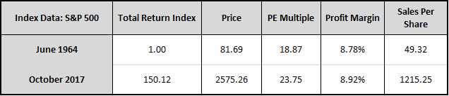
Comparing the final data to the initial data, we calculate the following annual return contributions over the period:
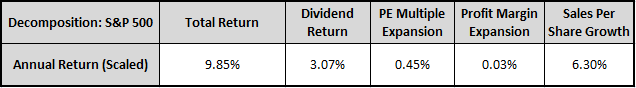
Of the S&P 500's 9.85% annual total return over the period, 3.07% came from dividends, 0.45% came from multiple expansion, 0.03% came from margin expansion, and 6.30% came from sales growth. These results indicate that virtually all of the S&P 500's return over the period came from the fundamental sources of growth and income. The contribution from multiple expansion and margin expansion was negligible2, due in part to the fact that multiples and margins in 1964 were not far off from where they are today.
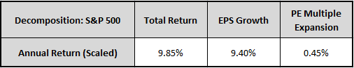
To simplify the decomposition, we can convert dividends into share buybacks and combine profit margin expansion and sales per share growth into earnings per share (EPS) growth. All return sources other than multiple expansion will then show up as growth in EPS:
For simplicity, our decompositions in the piece are going to focus primarily on these two sources: EPS growth and PE multiple expansion. To reduce accounting distortions, we're going to compute the sources using earnings numbers that exclude income from extraordinary items and discontinued operations. For those interested, we share the mathematical details of our decomposition methodology in Appendix B.
The Problem of Turnover
To introduce the problem of turnover, we're going to start by showing you how decomposition can be used to help us answer an important question about the Value factor. We know that the Value factor generates excess returns. But how exactly does it do that? Where specifically do its excess returns come from?
Here are a few possible mechanisms that we could cite in answering the question:
- Yield: The excess returns could come from the higher yields that cheap stocks offer, in much the same way that corporate bonds with higher yields generate excess returns over treasuries.
- Fundamental Growth: The excess returns could come from the stronger fundamental growth that stocks in a downturn go on to experience when their business prospects improve.
- Multiple Expansion: The excess returns could come from the increased multiple expansion that occurs in cheap stocks as they become less cheap over time.
To measure the respective contributions that these mechanisms make to the Value factor's excess returns, we can try out the same decomposition technique that we just used on the S&P 500. If the results show a large contribution from growth, then (1) or (2) are likely to be the dominant mechanisms (recall that yield shows up as growth on our internal reinvestment assumption). Conversely, if the results show a large contribution from multiple expansion, then the dominant mechanism is likely to be (3).
The table below shows the results of a decomposition of the Value factor's returns from June 1964 to October 2017. The factor invests in the cheapest PE ratio3 quintile of large cap U.S. stocks and holds them for one year, rebalancing into a new set of cheap stocks at the end of every June month:
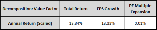
The results indicate that almost all of the Value factor's annual total return over the period--13.33% out of 13.34%--came from earnings growth, with only a miniscule portion coming from multiple expansion. The implication, then, is that the Value factor works by identifying companies that exhibit strong EPS growth, either because they have attractive organic growth prospects as businesses, or because they return large amounts of cash to shareholders at attractive prices, cash that then turns into EPS growth when reinvested into the index. Multiple expansion appears to be a negligible part of the process.
You can probably tell that this conclusion is not quite right. How could the Value factor outperform by generating stronger EPS growth? The justification for Value stocks being cheap is that their growth prospects are weak. If they actually have stronger growth prospects than the market, why would the market price them at a discount?
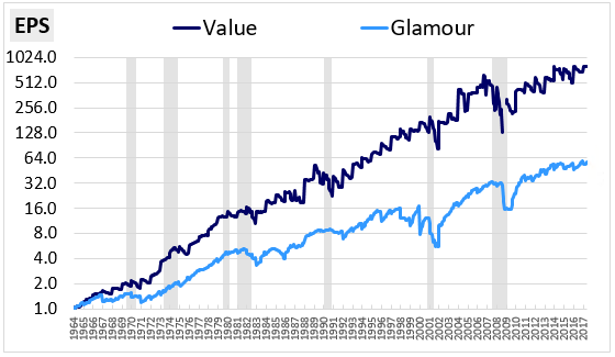
Something, then, is wrong. To figure out what that is, let's take a look at a chart of the Value factor's EPS alongside the S&P 500's EPS over time:
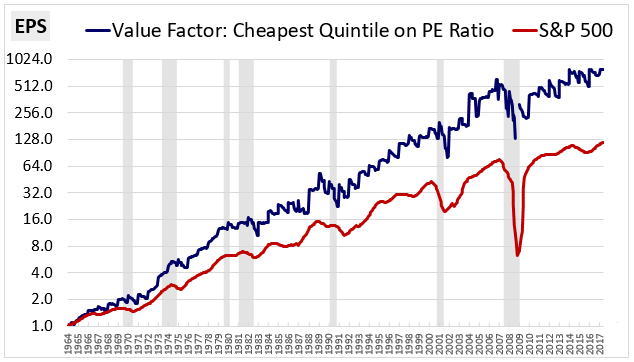
We do, in fact, see significantly higher EPS growth from the Value factor. But the Value factor's EPS (blue line) is showing a consistent jagged edge pattern, like the cutting surface of a saw (i.e., a "sawtooth"). What's going on?
Unlike the S&P 500, the Value Factor is an active investment strategy that exhibits a significant amount of turnover in its holdings each year. On a quintile basis, the factor's average annual turnover is around 38% per year, which means that 38% of the companies in the index each year are new companies with completely different earnings numbers. In every June month, when those new companies replace old companies in the index, step changes occur in the index's EPS, giving rise to the sawtooth pattern.
The decomposition that we performed above produced incorrect conclusions about how the Value factor works because it interpreted these step changes as EPS growth. But that "growth" was not real company growth. Rather, it was an artificial result of the turnover that repeatedly happens inside the index. To accurately use decomposition on factors, we're going to need to find a way to work around the effects of that turnover.
Working Around Turnover: A Partial Fix
One way that we can work around the problem of turnover is by limiting our decompositions to the holding periods in between scheduled rebalancing dates. Applying this approach to the example above, we would perform separate decompositions for each annual period between June of a given year and June of the next year. Because the index's holdings will remain relatively constant inside those dates, this approach will effectively eliminate the problem of turnover. Unfortunately, we can't use the approach on any periods that last longer than a year, or on any periods that fall outside of the specified rebalancing dates, because the factor will end up rebalancing into a new collection of companies inside the analysis window, distorting the results.
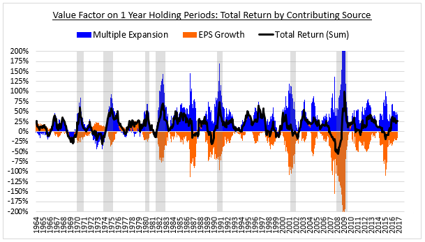
The chart below shows the decomposed one year returns of the Value factor calculated using the above approach. Instead of setting a specific rebalancing date in June, we form unique portfolios for the strategy in every month from June 1964 to October 2016. We then decompose the subsequent returns of those portfolios over a one year holding period into separate contributions from multiple expansion and earnings growth. The results are shown below by month:
The following chart smoothes out the return contributions by averaging the months in each calendar year together:
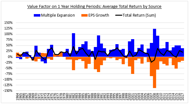
When we properly analyze the different holding periods in this way, we find that the Value factor generates its returns almost entirely through multiple expansion, shown in blue. The contribution from earnings growth in the underlying companies, shown in orange, is negative in almost every period in the chart. The narrative that value stocks are cheap because they suffer from weak growth is therefore 100% accurate—at least in the near term.4 Our earlier decomposition missed this fact because it ignored the effects of turnover.
Now, the problem with restricting the analysis to the holding periods in between rebalancing dates is that we're unable to see how the holding periods merge together to produce actual returns for the strategy. To fill in that gap, we need to develop a decomposition technique that can deal with turnover.
Rebalancing vs. Holding: Decomposing Returns in the Presence of Turnover
It's worth taking a moment to get clear on the exact problem that turnover creates for a return decomposition. When we decompose the returns of an index, what we're essentially doing is comparing the starting values of the index to the ending values and converting the differences into annualized return numbers. If companies are being traded into and out of the index during the analysis period--as happens in any higher turnover factor strategy--those values are going to shift for reasons that are unrelated to actual returns. The decomposition is therefore going to get thrown off.
To illustrate, consider the following example:
Example: A Value factor index buys a collection of cheap stocks at a PE ratio of 10. Over the next year, the earnings of those stocks remain constant, but the prices increase by 50%, raising the index's PE ratio to 15. On the one year rebalancing date, the index sells the PE 15 stocks, and buys a new collection of cheap stocks at PE 10. The process repeats itself in this way forever: the index buys at PE 10, sells at PE 15, buys at PE 10, sells at PE 15, and so on.
To figure out how much of the index's return over a given period is coming from multiple expansion, we would normally compare the PE multiple at the end of the period to the PE multiple at the beginning. But if we do this in the above example, we aren't going to see any difference. That's because each of the PE multiple increases that takes place in the example gets "erased" by subsequent rebalancing events that bring the PE multiple back to where it started. The table below, which shows hypothetical data for the index over a three year period, illustrates the problem:
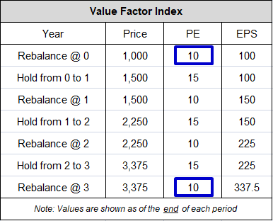
When we compare the PE multiple at year 3 to the PE multiple at year 0 (boxed in blue), we're not going to see any change--the multiple started out at 10 and ended at 10. We're therefore going to conclude, wrongly, that multiple expansion was not involved in producing the return, when in fact it was the only thing involved.
By resetting the PE multiple back to 10 in every period, turnover appears to be erasing critical information that we need in order to perform the decomposition. Fortunately, that information doesn't get fully erased from the index. Instead, it gets converted into a different form. It normally shows up directly as changes in the index's valuation numbers, but the turnover causes it to show up as changes in the index's fundamentals.
To see this conversion more clearly, consider the changes that take place when the above index is rebalanced at the end of the first holding period (boxed below):
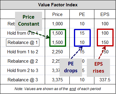
At the moment of the rebalancing event, when the PE multiple drops from 15 to 10 (blue), the EPS rises from 100 to 150 (red). The reason this happens is that that the rebalancing event shifts the index into a cheaper collection of companies, with more earnings relative to their prices. The price "P" of the index has to stay constant through that shift, so when the shift causes a drop in the "P/E", it necessarily causes a proportionate rise in the "E."
This fact is what preserves the information related to the valuation change that took place in the holding period prior to the rebalancing. In that holding period, the PE increased from 10 to 15. When the PE multiple gets reset from 15 back down to 10 in the rebalancing, the prior increase appears to get erased from the index. But it actually gets transferred into the index's EPS, which increases from 100 to 150.
What you have in the above example, then, is a recurring 50% increase in the multiple being repeatedly converted into a 50% increase in the EPS. Instead of seeing the PE multiple increase by 50% three consecutive times, from 10 to 33.75, the PE repeatedly gets reset back down to 10, remaining unchanged over the full period, with the EPS increasing by the same amount in its place, from 100 to 337.5. Since returns from multiple expansion and EPS growth are fungible, the index's overall return is unaffected by the transfer.
The basic rule to remember is this:
Rebalancing Rule: Whenever a rebalancing event causes a change in an index's valuation, the event will cause a proportionate change in the index's associated fundamental (e.g. EPS), and vice versa.
This rule is important because it allows us to keep track of valuation changes that appear to get erased from an index by rebalancing events. Those changes necessarily show up as changes in the fundamentals of the index--i.e., as fundamental growth.
Now, the EPS growth that occurs in rebalancing differs from normal EPS growth in that it occurs instantaneously on the rebalancing date. It's therefore easy to spot in charts and to track in computations. In fact, you've already seen it in a chart. You saw it in the sawtooth EPS pattern that we showed you earlier:
The vertical jumps in that pattern, which registered in the decomposition as a type of "growth", were the direct results of rebalancing events that erased prior multiple expansions from the index.
We refer to the growth that occurs in rebalancing as "rebalancing" growth. "Rebalancing" growth contrasts with "holding" growth, which is the normal fundamental growth that accrues to an index from the business activities of the companies that it holds. By carefully keeping track of these two types of EPS growth--"rebalancing" growth and "holding" growth--we can eliminate the distortions that turnover would otherwise introduce into our decompositions.
When evaluating data on the rebalancing growth and holding growth of an investment strategy, here's the key point that you're going to want to remember. If the rebalancing growth of the strategy is consistently positive, the implication is that the strategy is generating fundamental growth from a recurring process of multiple expansion. It's buying at a lower valuation, then selling at a higher valuation, then buying at a lower valuation, then selling at a higher valuation, and so on, with each sale and purchase leading to a jump in the associated fundamental. Conversely, when the rebalancing growth of the strategy is consistently negative, the implication is that the strategy is losing fundamental growth to a recurring process of multiple contraction. It's buying at a higher valuation, then selling at a lower valuation, then buying at a higher valuation, then selling at a lower valuation, and so on, with each sale and purchase leading to a drop in the associated fundamental.
Now, it's important to recognize that not all valuation changes that occur in an index get rebalanced out of it. To illustrate, suppose that the portfolio in our example above were to experience multiple expansion from PE 10 to PE 15 but then get subsequently rebalanced back into PE 15 stocks (rather than PE 10). The PE ratio would stay the same through the rebalancing, and the prior increase would not get converted into EPS growth. Its trace would remain in the portfolio's valuation, where it would influence future returns. This type of valuation increase--the kind that doesn't get rebalanced out of the index--is a special source of return that has to be treated separately in the decomposition. We refer to it as the return from "Unrebalanced Valuation Change."
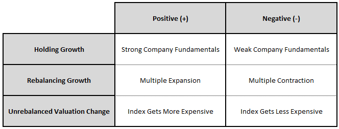
Using the categories of "rebalancing" growth and "holding" growth, we can decompose the returns of an index with turnover into the following three sources:
- Return from Holding Growth: This return is the return that accrues to an index from the normal fundamental growth of its underlying companies--i.e., growth associated with investment, acquisitions, share buybacks, and, on our internal reinvestment assumption, dividend income.
- Return from Rebalancing Growth: This return is the return that accrues to an index from valuation changes that get converted into fundamental growth through rebalancing events.
- Return from Unrebalanced Valuation Change: This return is the return that accrues to an index from valuation changes that do not get converted into fundamental growth through rebalancing events, and that instead stay present in the index all the way through to the end of the period being analyzed. This source of return can be unwound in future periods, and can therefore impact subsequent future returns.5
Positive and negative values for these sources convey the following meanings:
Applying this improved framework to the Value factor, our previous decomposition expands as follows:
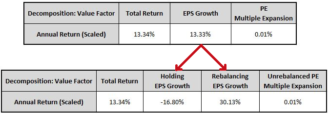
Earlier, when we concluded that multiple expansion was not a significant contributor to the Value factor's returns, we were looking at the multiple expansion that stayed leftover in the index through all of the rebalancing events. That multiple expansion is obviously negligible. What we were missing was the multiple expansion that was being erased every time the factor rebalanced into cheaper stocks. Our improved framework correctly detects that multiple expansion in the form of rebalancing growth, which, at 30.13%, is strongly positive.6 We describe the methodology that we use to compute Holding Growth and Rebalancing Growth in Appendix C.
With our decomposition toolkit built, we're now ready to analyze actual factor returns.
How Value Works: A Re-Rating of Future Fundamentals
In this section, we're going to examine the market processes that underlie the Value factor. We're going to demonstrate that there is real value in the Value factor, and that its excess returns are fundamentally justified. We're then going to examine the Value factor's recent underperformance relative to its history, surveying a set of possible causes and evaluating potential implications for the future. We're going to conclude the section with a discussion of Value factor timing.
Value and Glamour
The chart below shows the total return of a Value strategy alongside the total return of what we pejoratively refer to as a "Glamour" strategy from June 1964 through October 2017. As before, the Value strategy invests in the cheapest (1st) quintile of large cap stocks on the basis of the PE ratio, while the Glamour strategy invests in expensive quintiles. We actually show the returns of both the 4th and the 5th quintiles in the chart:
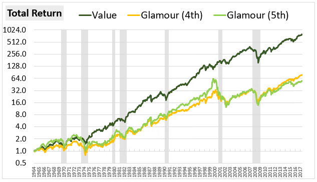
The 5th quintile has the lowest performance of all, but its underlying companies tend to have large quantities of negative earnings that are difficult to coherently graph. We're therefore going to focus on the 4th quintile in our analysis.
The following table shows the decomposed returns of the strategies by source:
As you can see, the Value strategy outperforms by 4.80% per year. We see this outperformance in the fundamental growth of the two strategies, with Value's EPS outpacing Glamour's EPS by 5.44% per year:
The Underlying Dynamic
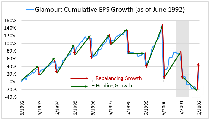
The following chart provides a close-up look at the graphical EPS pattern of the Value strategy. We focus specifically on the 10-year period from June 1992 to June 2002:
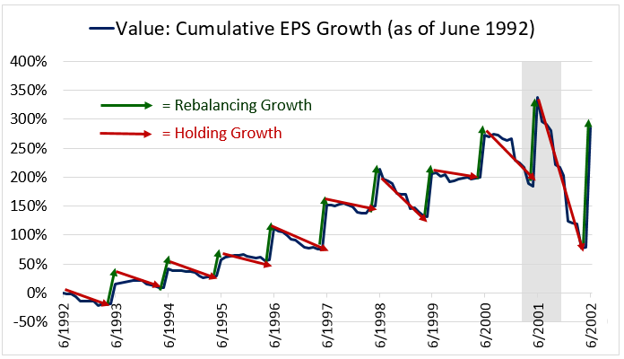
The consistent pattern of strong positive rebalancing growth, which comes in at 30.13% per year for the overall period, suggests that two related processes are taking place: first, multiple expansion, and second, churn.
With respect to multiple expansion, when the strategy rebalances, it's rebalancing into stocks that are cheaper than the stocks that it's currently holding. We know that to be the case because the strategy is generating positive EPS jumps in the rebalancing events, and the only way to generate those jumps is to rebalance into positions that are cheaper, i.e., positions that have more EPS relative to their prices. But the stocks that the strategy is currently holding were originally the cheapest stocks in the entire market. Those stocks must therefore be getting more expensive during the holding period, experiencing multiple expansion.7
In general, this multiple expansion needs to produce an actual movement of stocks across the PE quintile boundaries, a phenomenon that we refer to as "churn." The cheap stocks that the strategy is holding have to be moving upwards across those boundaries, becoming less cheap, so that they get sold in the rebalancing events. At the same time, other stocks in the market have to be moving downwards across the boundaries, into the cheapest quintile, so that the strategy has a fresh pool of new cheap stocks to rebalance into. Without this churn, the strategy will end up rebalancing into its own current holdings, which is to say, not rebalancing at all.8
The chart below, which shows the index's changing PE ratio over the same period, confirms that a consistent process of multiple expansion is driving rebalancing growth in the factor:
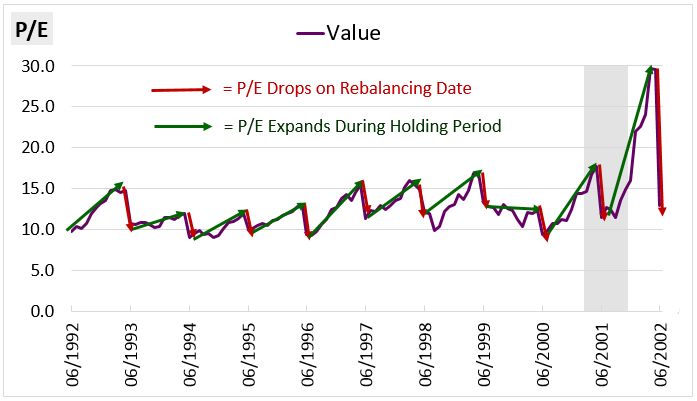
The PE multiple gradually expands during the holding periods, then drops on the rebalancing dates as the strategy rebalances into cheaper stocks. For the 1990s period, the typical movement was from a PE of around 10 to a PE of around 15, then back to a PE of around 10 on the rebalancing.
Turning now to the holding growth of the Value strategy, we see a consistent negative trend: in every period of the chart, the EPS either drifts downward or remains flat. Looking at the full period of the analysis, the holding growth comes in at -16.80% per year. The implication is that the strategy is investing in companies with weakening fundamentals. Indeed, the weakening fundamentals are part of the reason that the multiple is expanding--the "E" is going down, which is pushing up on the "P/E." But falling EPS isn't the only driver of the multiple expansion that's taking place--if it were, then the strategy would not generate the upward EPS progress that we see in the chart.
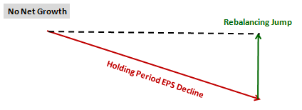
If the sole driver of the multiple expansion in the strategy were falling earnings, then the strategy's overall EPS would not make upward progress over time. Mathematically, the gain from the rebalancing jump would exactly offset the loss from the holding period decline, producing no net growth for the strategy, which is depicted in the image below:
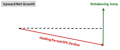
But what we actually see is consistent upward net growth for the strategy, which confirms that the multiple expansion is due, at least in part, to the price itself increasing:
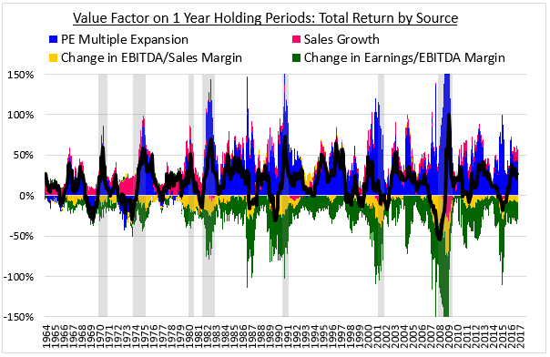
Using our earlier technique of analyzing isolated one year holding periods, we can decompose the Value factor's earnings declines into contributions from changes in profitability across different parts of the income and cash flow statements. In the chart below, we express the declines in terms of changes in sales (fuchsia), changes in the EBITDA to sales margin (yellow), and changes in the earnings to EBITDA margin 9 (green). As before, the blue columns show the contribution from multiple expansion and the black line shows the sum of all the contributions, i.e., the total return:
In the chart below, we express the above sources of return relative to the equal-weighted market:
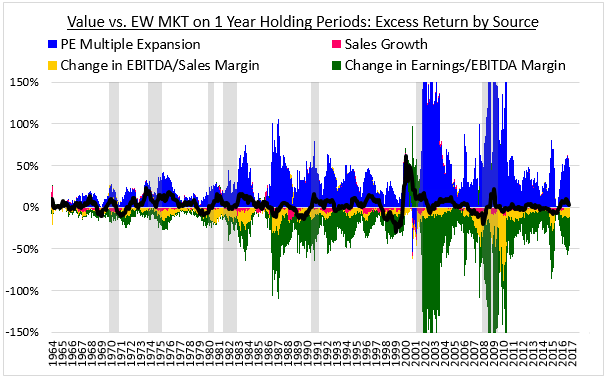
As you can see, the earnings declines are being driven by pervasive weakness across all of the sources: meager sales growth that comes in consistently below the market, substantial declines in the EBITDA to sales margin, and larger declines in the earnings to EBITDA margin.10
These clues suggest that the following market dynamic is occurring. Certain stocks in the market are experiencing weakness in their fundamentals. The weakness could be driven, for example, by downturns in the profit cycles of the underlying companies or deeper problems in their underlying businesses. The market is detecting the weakness and reacting to it by pricing the stocks very cheaply relative to current earnings, which are not expected to be sustained. The Value factor is buying into the stocks at the very cheap prices and holding them for a one-year period. During that period, the fundamentals end up coming in weak, as expected. But the market, which is looking farther out into the future, becomes less pessimistic about the stocks and re-rates them higher, lifting their prices and valuations. At the end of the holding period, the Value strategy sells out of the stocks at the higher prices and valuations and rebalances into a new collection of stocks that have since become cheap by a similar process. This rebalancing lowers the strategy's valuation, "converting" the gains from the prior multiple expansion into a jump in EPS on the rebalancing date. The strategy repeats this process over and over again, generating a highly attractive net return.
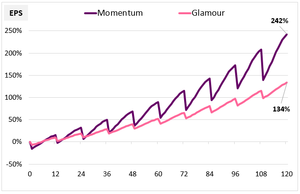
When we look closely at the EPS of the Glamour Strategy, we see the opposite pattern play out. Each year, on the rebalancing date, the Glamour Strategy's EPS tends to drop as it trades less expensive names for more expensive names (the opposite of what we saw with Value). Then, during the subsequent holding period, the EPS tends to exhibit solid growth back upward (again in sharp contrast with Value). The following chart, again taken from the June 1992 to June 2002 period, provides a closer look:
The Glamour strategy's holding growth is strongly positive, which indicates that the strategy is buying companies with strong fundamental growth and riding out that growth during the holding periods. But it's paying up for the growth, purchasing the stocks at very expensive prices. During the holding periods, the earnings grow and the elevated multiples contract. Consequently, on the rebalancing date, when the strategy rebalances back into the most expensive stocks in the market, it rebalances into a new collection of stocks that are more expensive than the stocks that it is currently holding. Its valuation therefore increases in the rebalancing, bringing about a step drop in its EPS. This drop shows up in the decomposition as negative rebalancing growth, which averages out to -9.29% per year over the full analysis period.
Importantly, the better growth that tends to accrue to the Glamour Strategy during the holding periods isn't enough to sufficiently offset the multiple contraction and associated drops in EPS that tend to occur on the rebalancing dates. As a result, the strategy tends to underperform. In the above period, 1992 to 2002, the Glamour strategy generated net EPS growth of roughly 40%, whereas the Value Strategy generated net EPS growth of almost 300%.
With the Glamour Strategy, the market is likely engaging in a reverse form of the re-rating process described earlier for the Value Strategy. Just as the market appeared to be delivering a boost to the Value Strategy by upwardly re-rating low-growth companies that it had been valuing too pessimistically, it appears to be imposing a drag on the Glamour Strategy by downwardly re-rating high-growth companies that it had been valuing too optimistically.
Changing the Holding Period and the Concentration
We can gain additional insight into how the Value factor works by examining its fundamental performance over very long holding periods. All of the charts that we've examined so far have assumed a one year holding period. In the chart below, we show the EPS of Value and Glamour on a 10 year holding period, with rebalancing events in June 1964, June 1974, June 1984, June 1994, June 2004, and June 2014:
The Value factor's outperformance drops off significantly, falling from the prior 4.80% per year to 1.65% per year. If we squint carefully at the chart, we can see the same re-rating process that we saw earlier, with holding period multiple expansion converted into an EPS jump on each rebalancing date. But the process happens much less frequently, with the associated gains diluted out over a much longer period of time.
The sharp drop-off in the factor's performance over longer holding periods suggests that the gains associated with the re-rating process are stronger in the early phases. Conventional medium-term holding periods (e.g., 1-2 years) are optimal because they rebalance frequently enough to catch the sweet spot of the process and then move on to other opportunities, but not so frequently as to accumulate excessive trading costs.
Up to this point, we've been showing you the earnings trajectories of actual portfolios formed on specific monthly dates across market history. To get a clearer picture of the central tendency in factor performance, we can take the earnings trajectories of all portfolios formed on all monthly dates across market history and average them together. That's what we're now going to do.
To construct the chart below, we form unique Value and Glamour portfolios in each month of history between December 1963 and October 2007. We then average together 11 their cumulative EPS growth numbers through each month after initial formation out to 10 years.12 The portfolios are held for the entire 10 year period, with no subsequent rebalancing:
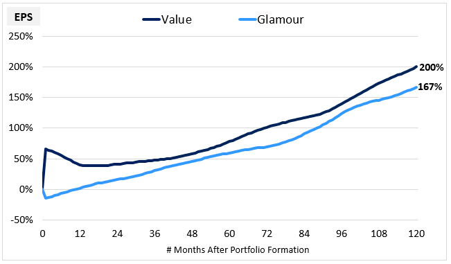
The initial jump in the Value portfolio is from the rebalancing growth that occurs at portfolio formation. The rest of the gain is from holding growth. On net, the Value strategy generates more EPS growth than the Glamour strategy, but the difference--roughly 1.2% per year--isn't very large.
In the chart below, we show the same average cumulative EPS growth, but this time for Value and Glamour portfolios that are rebalanced every 12 months:
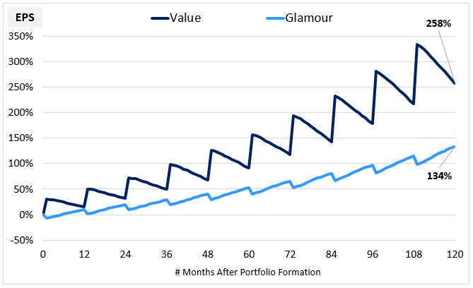
The outperformance increases to around 4.3% per year. The reason for the increase is that the 12 month strategy leverages the re-rating process in a tighter, more efficient way. It captures the powerful early parts of the process, where the gain-to-time-invested ratio is higher, and then moves on to capture those parts again in new collections of cheap stocks. The Glamour portfolio does the opposite. It captures the parts of its re-rating process where the relative losses are greater, and then moves on to capture those parts again in new collections of expensive stocks.
We see a similar increase in the performance of the strategy when we increase its concentration. The following chart shows the average EPS growth of the Value Factor at concentrations ranging from the cheapest 50% of stocks to the cheapest 5% of stocks. The averages are drawn from all 5 year analysis periods between December 1963 and October 2012, with the portfolios rebalanced on a 12 month periodicity:
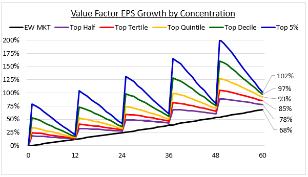
As the factor becomes more concentrated, the underlying sawtooth pattern steadily intensifies and the fundamental outperformance steadily increases. The strong relationship between the concentration of the factor, the intensity of the sawtooth pattern, and the overall outperformance suggests that these features are tied together in the factor in an integral way.
The Basis for Value's Outperformance: Actual Recovery in Fundamentals
Up to this point, we've been representing the fundamentals of the Value Factor in terms of trailing earnings. But when the market sets prices for stocks, that isn't its focus. It's focus is on the long-term future streams of earnings that the stocks will go on to generate. When it re-rates Value stocks higher, it re-rates them based on improved expectations around those future streams, not based on anything related to trailing one-year numbers.
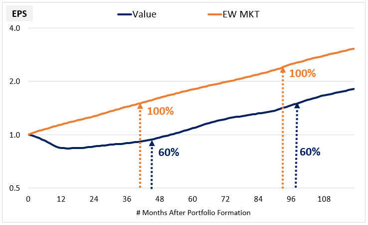
To determine whether this re-rating is justified, we can examine what happens, on average, to the earnings of Value stocks when they are held over the very long-term. The following chart shows the average EPS stream of Value portfolios alongside the average EPS stream of the equal-weighted market over all 10 year holding periods that started between December 1963 and October 2007. The averaged portfolios are formed in month 0 and then held constant for 10 years without any rebalancing. If stocks in the portfolios are acquired or delisted during the periods, the proceeds are reinvested into the holdings that remain. Both streams are normalized to a starting value of 1.0:
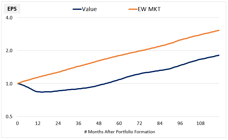
As we would expect, the Value EPS stream experiences an initial downturn relative to the Market EPS stream. About a year into the process, it bottoms out and begins to recover. After around four years, its growth rate converges onto the Market's growth rate:
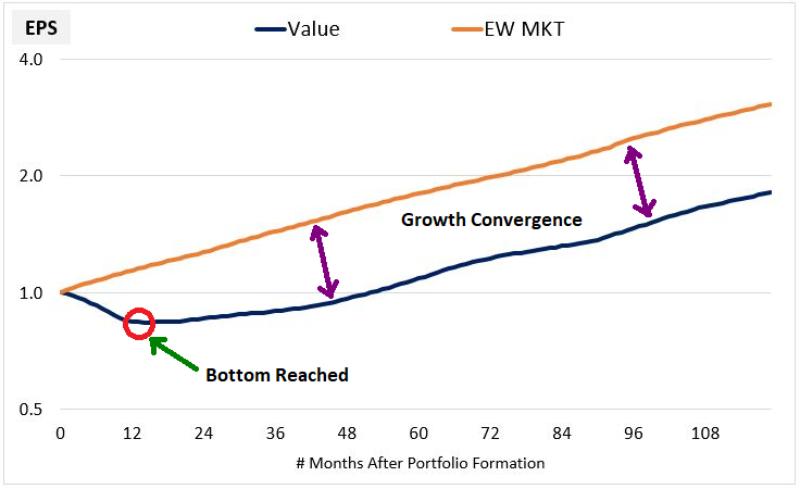
The chart below illustrates the convergence more clearly by normalizing the streams to a common value of 1.0 at month 60. As you can see, from around month 48 onward, the two streams grow at the same pace. They essentially become the same stream:
The Value portfolio's eventual recovery to a normal market growth rate is important because it vindicates the re-rating that takes place earlier in the process. The anticipation of such a recovery is precisely what the re-rating is about--the market sees the early signs of stabilization and improvement in the earnings of Value stocks and upgrades their prices and valuations accordingly. We can see this anticipation clearly in a chart of the average PE ratio and EPS:
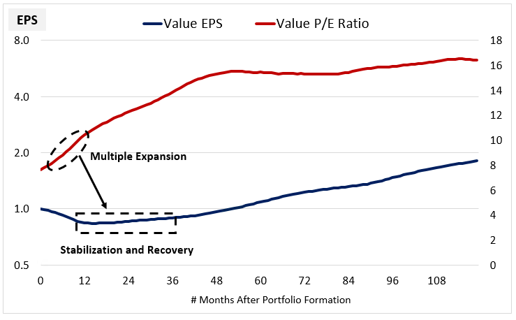
The multiple expansion isn't arbitrary, but occurs in advance of an actual, legitimate fundamental turn. When set to a 12-month holding period, the Value Factor trades around the sweet spot of that process, leveraging it over and over again into a significant excess return. Think here about taxi medallions once more. The outlook has been dire because of Uber's fast and dominate rise, but if the cash flows from medallions are going to stabilize per the chart above (a big if), then their distressed current price may represent a buying opportunity.
Estimating the Valuation Disparity
The Value EPS stream shown above trades at an initial valuation discount relative to the market stream. This discount is justified because, in the first few years after portfolio formation, the stream grows more slowly. A discount is needed to make up for the difference that develops between the sizes of the two streams in the run-up to the point where their growth rates converge.
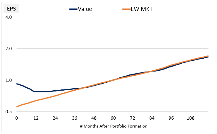
The question we want to pose is this: on average, is the initial valuation discount that the market applies to the Value portfolio fair? Or is it excessive? We can estimate an answer to the question by performing a simple back-of-the-envelope calculation on the average data. Notice that when growth convergence is reached, the average size of the Value EPS stream is roughly 60% of the average size of the Market EPS stream:
For this lost ground to be appropriately compensated for, the Value stream needs to initially be valued at 60% of the valuation of the Market stream. That's the efficient price, the price that will leave buyers of the two streams equally well off at the end of the period. 13
On average, the market stream is initially valued at a PE ratio of 15.3x, therefore the Value stream should initially be valued at a PE ratio of 9.2x, which is 60% of 15.3x. But In actuality, we find that the market sets the average initial PE ratio for the Value stream at 7.6x, roughly 17% cheaper than 9.2x:
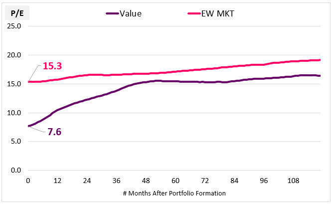
The implication, then, is that recently-formed Value portfolios trade at an excessive discount relative to their actual future earnings. The tightening of that discount over the subsequent holding period is what drives the Value Factor's outperformance.
Comparing Current Prices to Future Earnings
To keep the analysis going from here, we're going to need to shift from talking about PE ratios (i.e., "P/E") to talking about earnings yields (i.e., "E/P"), which are the inverses of PE ratios. So take a moment to get ready for that mental shift. With earnings yields, high means cheap, and low means expensive--the exact opposite of before.
We can confirm the underpricing of Value portfolios by comparing their actual future earnings 10 years out from the portfolio formation date to their current prices. We refer to the associated yield as a "future earnings yield" (E10-YLD) and we track its average trajectory in Value and Market portfolios across history over the course of 10 year holding periods. We get the following result:
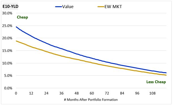
As you can see, the Value portfolio is initially priced to deliver a 25% future yield relative to its earnings in year 10, 6% more than the market, which is priced to deliver a 19% future yield. As the portfolios move through the holding periods, the prices increase and the associated future yields fall, reducing the initial 6% spread to less than 1%.
The following chart shows the evolution of the spread (green) between the future yields of Value and the Market alongside the yield premium (red) that this spread represents over the Market yield. The yield premium tells us how much "extra" yield in percentage terms the Value factor is offering compared to the market. It's the mathematically correct way to think about valuations in the context of yields:
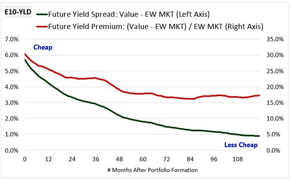
The yield premium shrinks from roughly 31% to roughly 17%. Mathematically, that shrinkage translates directly into an excess return for the Value portfolio. 14
We might think that the initial differences between the future yields of Value and the Market are warranted by the initial differences in their growth rates. But by the time year 10 is reached, their growth rates will have significantly converged. Their future yield levels measured against earnings on that date should therefore be roughly similar at all times. The fact that these yield levels are not similar upon portfolio formation is evidence of a market inefficiency.15 The market is imposing an excessive discount on Value portfolios, pricing them too cheaply relative to the actual future earnings that they go on to generate.
Now, the charts above are charts of average portfolios that do not themselves exist in the market. To confirm the patterns observed in those charts, we can look at actual portfolios across history. The chart below shows the actual future earnings yields of all Value and Glamour portfolios formed between December 1963 and October 2007. We form the portfolios in each month and then follow them for the next 10 years, without any rebalancing. As before, the future earnings yields are calculated as the earnings 10 years into the future divided by the price at portfolio formation:
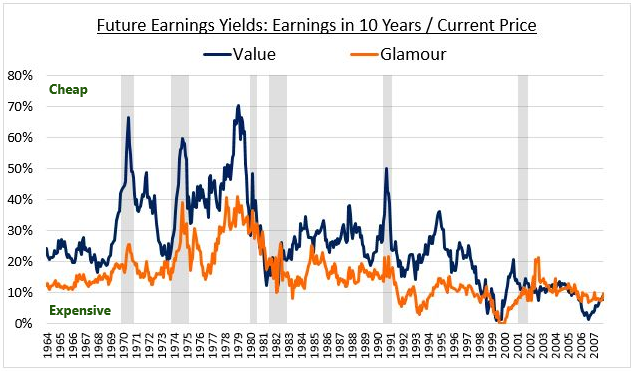
As you can see, when measured against their actual future earnings 10 years out, Value portfolios have historically sold at large discounts relative to Glamour portfolios. Across history, the average future 10 year yield premium between the two types of portfolios was 71.22% in favor of Value, a substantial and highly statistically significant premium (t-stat: 22.4). The significant "extra" future yield that Value stocks go on to deliver to investors confirms that the Value factor is grounded in something real. There's real value in Value stocks, and the factor makes its money by capturing it.
Interestingly, the only extended period of history in which Value did not sell at a substantial future yield premium to Glamour was in the most recent decade, in the run-up to the financial crisis. That was also a period in which Value performed poorly relative to its history. We will discuss a possible relationship between these two occurrences in the next section.
Making Sense of Value's Recent Performance
The subpar performance of Value investing over the last decade has caused many in the investment community to wonder whether the practice still works. In the next several paragraphs, we're going to offer a few thoughts on the topic.
Obviously, periods of underperformance are to be expected in any investment strategy. To put the Value factor's recent performance into appropriate perspective, we need to examine it in the context of history. In the chart below, we take Value portfolios formed in each month from December 1963 to October 2016 and follow their performances over a subsequent one year holding period, plotting their realized excess total returns over the equal-weighted market:
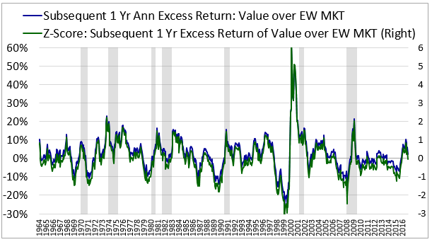
As you can see, since around 2005, the Value factor has put together a string of below average excess returns relative to history. Why have these returns happened? Will they keep happening?
We can be pretty confident that at least a portion of the weakness in the returns is due to the financial crisis. As we highlighted earlier, the 10 year future yields of Value portfolios ended up coming in below the future yields of the market in essentially all 10 year periods that overlapped with the crisis:
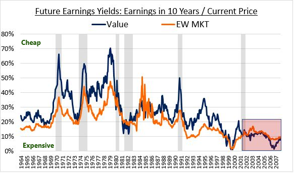
This highly unusual historical outcome confirms that the crisis had a crushing effect on the earnings of Value stocks. So when we find that the re-rating process that drives Value's outperformance failed to occur in that period, we shouldn't be surprised. Fundamentally, the re-rating process shouldn't have occurred, because the earnings of Value stocks in the period failed to actually recover in a way that would justify it.
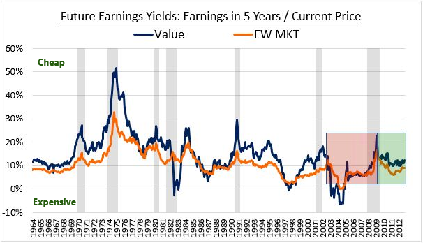
To bring in more data, we can look at the future earnings yields of Value and Market portfolios on earnings 5 years out. From around 2010 onward, we see the spreads widen, consistent with the relief provided by the passing of the crisis. But even after this widening, the spreads remain somewhat compressed relative to history. They haven't translated into the usual outperformance for the factor:
Finding a satisfying explanation for the factor's subpar performance in the period after 2010 is a difficult task. A number of hypotheses can be offered, but there isn't really a smoking gun that can serve as proof for any of them. If we ourselves were forced to come up with an explanation, we would probably point to the fact that in the current economic cycle, certain types of hyper-profitable "new economy" companies--think Facebook, Amazon, Netflix, Google--have dominated the return landscape. Statistically, these companies aren't as likely to end up in Value portfolios as "old economy" companies such as those from the energy, material, industrial, financial and retail sectors, groups that have obviously had a much a harder time.
Whatever the causes of Value's current bout of underperformance turns out to be, the fact remains that similar bouts of underperformance have occurred in the past--the late 1960s, the late 1980s, and the late 1990s provide good examples. After each of those periods, the Value factor went on to produce excellent returns. In hindsight, it would have been a clear mistake to have abandoned the factor. Given the vast historical evidence that exists in the factor's favor, we think abandoning it today will likely prove to be a mistake as well.
If the Value factor's recent weakness could be attributed to Value stocks becoming significantly cheaper relative to the market, that would obviously be good news for Value investors. Value would then represent a "coiled spring" of sorts, primed to outperform in the future as valuations revert back to normal. Unfortunately, relative to historical averages, Value stocks today aren't very much cheaper than the market. The Value factor has a current PE ratio of roughly 13, 44% higher than its historical average of roughly 9, while the equal-weighted market has a current PE ratio of roughly 25, 56% higher than its historical average of roughly 16. 16
Over the long-term, the real risk to the Value factor's ability to outperform lies not in the possibility that Value companies might suffer periods of extended fundamental weakness, but rather in the possibility that the market might eventually get on board with the Value factor and arbitrage away its edge. If market participants as a group were to alter their behaviors and upwardly correct the mispricings that they tend to impose on Value stocks, Value strategies would have nothing to exploit.
In attempting to explain Value's recent performance, arbitrage is obviously an easy culprit to blame. But in terms of actual evidence of it playing a role in the underperformance, there isn't any. If a successful arbitraging of the factor were to have occurred, we would see it in current valuations. Investors would be pricing Value stocks more expensively relative to the market, and that expensiveness would be detectable in the actual numbers. But nothing like that is actually happening right now. Value is not any more expensive relative to its own history than the market--to the contrary, it's cheaper.
In any given period, it's possible that the Value factor will end up drawing in a large number of "Value Traps", companies whose fundamentals fail to stabilize and recover per the normal pattern. That's probably what has happened in the current period, though the specific drivers are hard to pin down. If it does happen, the Value factor won't outperform and shouldn't outperform. Aside from accepting the possibility as a risk that comes with Value investing, the only thing that a Value investor can do is augment the Value factor with other factors that can filter out problematic companies. In subsequent pieces, we plan to discuss examples of effective additional factors that Value investors can use.
Timing the Value Factor
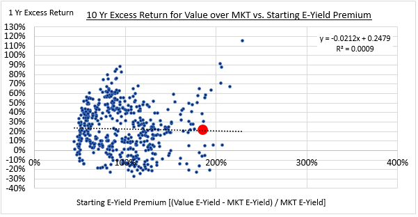
Intuitively, we would expect there to be a relationship between the relative cheapness of the Value factor at the start of a holding period and the excess returns that the factor goes on to produce during that period. To test for the existence of such a relationship, we form Value and Glamour portfolios in each month of history from December 1963 to October 2016 and compare the subsequent 1-year excess returns to the starting valuation difference:
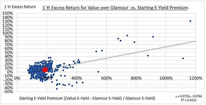
We find that there is, in fact, a relationship. Statistically, the initial valuation premium explains around 42% of the variance in the subsequent excess returns. The relationship is weaker than we might initially expect because the key variable that drives the Value factor's excess returns is the re-rating process, and the degree of the initial valuation difference in any given period isn't a very good predictor of the extent to which that process will occur in the period.
Some might interpret the existence of the relationship as justification for attempts to "time" the Value factor on valuation. The problem, however, is that the dispersion of the factor's return outcomes is very high at normal valuation levels. A consistent correlation with excess returns only emerges at extremes. To confirm this point, we can separate the chart into different 5-year historical bins:
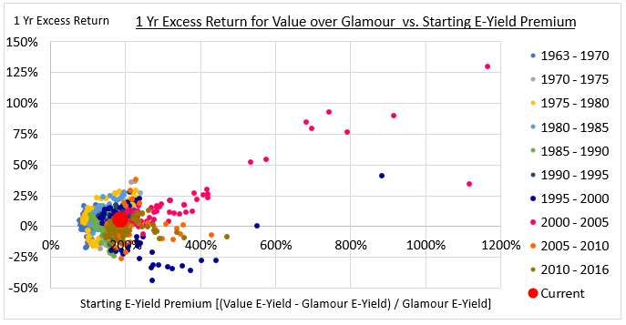
As you can see, the data points that are driving the perceived relationship are data points associated with the aftermath of the Tech bubble, shown in hot pink. If the chart is telling us something, then, it's telling us that we should make sure to be exposed to the Value factor whenever we find ourselves in a generational growth bubble. But that's something that we probably could have figured out without looking at data. Moreover, we aren't in such a situation right now, nor are we near one, so the insight is not presently actionable.
Interestingly, if we compare the valuation of the Value factor to the Market instead of to Glamour, the measured correlation falls to roughly zero, i.e., no relationship.
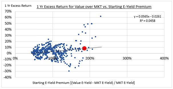
The reason the correlation falls to zero is that the Market portfolio doesn't have the same concentrated exposure to high-growth Glamour stocks that the Glamour portfolio had. The extreme data points from the Tech bubble therefore get moderated, causing the previously observed correlation to disappear:
Normally, when investors attempt to use valuation to forecast future returns, they focus on horizons that are long enough to average out noise and bring out the central tendencies in equity performance. But if we attempt to do that with factors, we will again run into the problem of turnover. Today's valuation spreads may provide information on the likely returns that a factor will earn in today's holding period, but they cannot tell us much about the returns that a factor will earn in a future holding period several years from now, when most of the current positions will have been changed out for new ones.
The chart below confirms this point. It compares the initial Valuation difference between Value and the Market and the subsequent 10 year excess returns assuming a 12 month rebalancing periodicity. As you can see, there's no relationship at all:
We can summarize our conclusions with respect to the Value factor as follows:
- Relative to actual realized future earnings, the market imposes an excessive discount on Value stocks. The Value factor generates excess returns by efficiently capturing the eventual tightening of that discount.
- The Value factor's recent underperformance is likely attributable to uncharacteristic recent weakness in Value stock fundamentals, not to a broader market arbitraging of the factor. Expect to see more on this topic in subsequent research papers.
- The relative valuation of Value stocks is related to the Value factor's subsequent excess returns, but the relationship only holds at extremes and is not consistent enough to justify efforts to time the factor.
How Momentum Works: A Growth Strategy Done Right
In this section, we're going to use our framework to examine the inner workings of the Momentum factor. We're going to find that Momentum generates its excess returns in an opposite manner from Value, a fact that helps explain why the two strategies complement each other well in diversified portfolios. We're going to conclude the section with a brief discussion of Momentum factor timing.
Winners and Losers
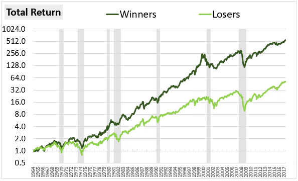
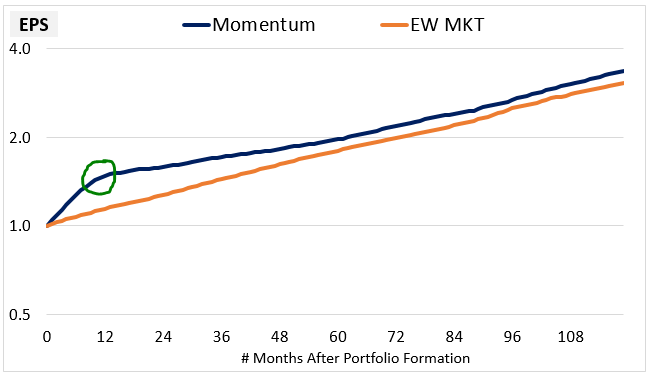
The following chart shows the total return of a Momentum strategy, which we will also refer to as a "Winners" strategy, alongside the total return of its corollary, which we will refer to as a "Losers" strategy, from June 1964 through October 2017. The Momentum (Winners) strategy invests in the top quintile of large cap stocks on trailing six month returns while its corollary, the Losers strategy, invests in the bottom quintile:
The chart below shows this outperformance in the context of EPS growth:
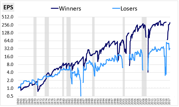
The numbers aren't as clean, but if you look closely, you can see the same "sawtooth" EPS patterns that we observed earlier. The Winner strategy's EPS drops down on the rebalancing dates and rises back up during the holding periods, similar to Glamour. The Loser strategy's EPS jumps up on the rebalancing dates and drifts back down during the holding period, similar to Value. The key difference is that in this case, the Glamour-like strategy is the one that outperforms.
The following table shows the decomposed returns of the strategies by source:
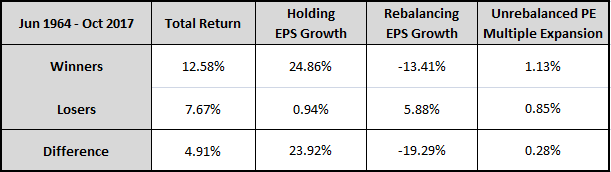
The decomposition confirms that the Momentum factor is riding a pattern of strong growth in the underlying companies that it holds, offset by multiple contraction and associated EPS losses on the rebalancing dates. The strong growth is adding more to the EPS than the multiple contraction and rebalancing losses are taking away, generating substantial upward progress for the strategy. The Loser strategy, of course, is doing the opposite, with much less success.
The table below shows the decomposed returns of Momentum alongside Glamour:
Notice the stronger holding period EPS growth that Momentum enjoys relative to Glamour. The difference suggests that Momentum is doing a better job of identifying growing companies than Glamour (pure expensiveness) was doing. And instead of giving the extra growth back through multiple contraction, it's keeping a sizeable portion of it, which is where its outperformance is coming from.
The lesson for investors is that if you want to find companies that are going to experience strong upcoming growth, you should look for companies with strong recent returns, not companies trading at high valuations. Empirically, strong recent returns are a much better predictor of future growth than simple expensiveness.
The chart below provides a visual picture of the differences between the EPS patterns of Momentum and Glamour strategies. We calculate the average EPS growth of the two strategies over all historical 10-year periods and plot the results alongside each other:
Consistent with the numbers above, we find that Momentum outperforms Glamour by selecting for companies with exceptionally strong holding period growth. The strategy experiences a greater drag from multiple contraction, evidenced by its slightly larger rebalancing losses, but the higher growth more than offsets those losses, allowing it to easily win the race in the end.
When we increase Momentum's concentration, we see an intensification of this pattern:
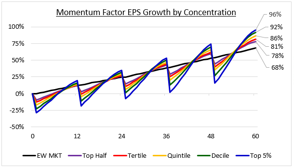
On each incremental increase in concentration, the holding growth increases, adding to the overall outperformance. The close correlation between the concentration of the factor and the strength of the holding growth provides further evidence of Momentum's efficacy as a pure growth signal.
Divergence from Fair Value and Momentum's Subsequent Reversal
The Momentum dynamic gets significantly more interesting when we extend the holding period. In stark contrast to Value, Momentum strategies show a tendency towards long-term reversal. 17 Starting from around the one year point onward, they underperform.
We can see this underperformance in the chart below. The green column shows the initial one year annual excess returns of Winner portfolios over Loser portfolios formed between December 1963 and October 2007. The blue column shows the excess returns of those same portfolios from the end of the 1st year to the end of the 10th year (assuming you hold them the entire time with no rebalancing):
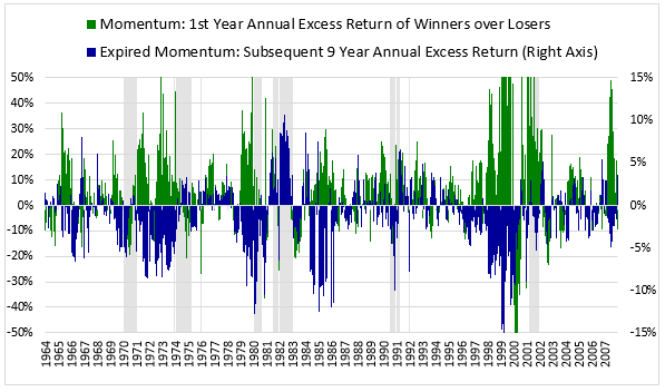
The initial one year excess return is consistently positive (green on top), averaging out to 7.48% (t-stat: 8.96). But the subsequent excess return over the next 9 years is consistently negative (blue on bottom), averaging out to -1.49% per year (t-stat: -8.50).
Here's a similar chart of the excess returns of Momentum over the equal-weighted market:
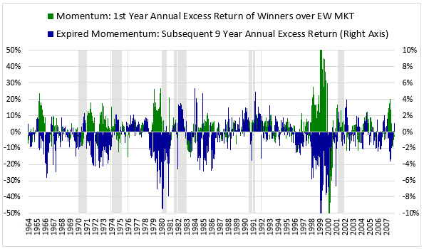
The average 1st year excess return is 2.83% (t-stat: 5.92), while the average excess return over the subsequent 9 year period is -0.85% per year (t-stat: -8.30).
The fact that Momentum reverses itself on longer holding periods suggests that it generates its excess returns through a divergence away from fair value. Stocks that are either initially fairly valued or slightly overvalued experience significant price increases and become more overvalued, generating attractive returns for those who sell at the one year point, but negative subsequent returns for whoever those individuals sell to. This divergence is the opposite of what we saw in the Value factor, where the excess returns were generated through a convergence towards fair value--i.e., mispriced Value stocks becoming less mispriced.
We can confirm the divergence that drives Momentum's excess returns using the same techniques that we used earlier on the Value factor. To begin, we plot the average EPS of the Momentum factor over all historical 10 year holding periods alongside the average EPS of the market:
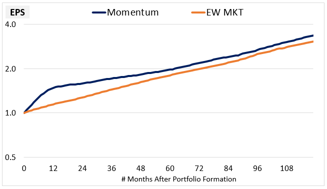
Consistent with our earlier observations, we see that Momentum generates very strong EPS growth during the initial 12 month period, building up a noticeable lead over the market. But the growth subsequently declines, causing the lead to dwindle. At the point of growth convergence, which we can say occurs around month 60, Momentum's EPS is only 9% above the market's EPS. Per the logic explained earlier, it follows that Momentum should trade at an initial 9% valuation premium to the market (on its trailing earnings). But in actuality, we find that Momentum trades at an average 19% initial premium. So it starts out slightly overvalued--by an amount roughly equal to 10%.
This 10% number is not a huge amount, but it only represents the overvaluation at the point of portfolio formation. Obviously, the relative gains that Momentum generates after that point increase the overvaluation that the strategy starts out with. We can see the increase in the chart below, which shows the valuation of Momentum relative to the Market measured on earnings 10 years out:
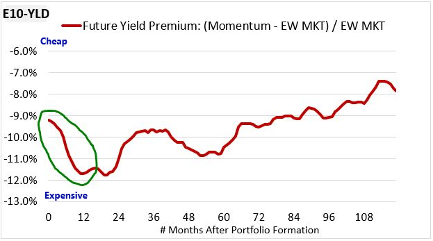
The yield premium starts out around -9%, confirming our earlier back-of-the-envelope calculation that showed Momentum to be slightly expensive relative to the market. But instead of converging towards parity and inflicting losses on Momentum investors, the yield premium initially gets more negative, with Momentum getting more expensive. The increased expensiveness is precisely where the factor's excess return on a 12 month holding period comes from, which is why we classify its alpha as divergent.
Now, the charts that we've shown above are charts of averages. We can find further evidence to support the conclusion that momentum is a divergent phenomenon by tracking the future earnings yields of actual portfolios across history. The chart below shows the 10 year future earnings yields of all Momentum and market portfolios formed between December 1963 and October 2007:
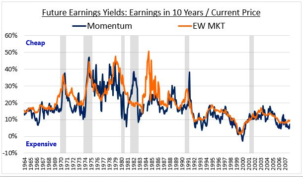
As you can see, Momentum's future earnings yield comes in below that of the market in almost all regions of the chart, indicating that Momentum is at best fairly valued and probably overvalued. And that's at portfolio formation, before the strategy goes on to generate excess returns. As those returns get produced, the overvaluation increases.
Now, the fact Momentum profits from a divergence away from fair value should not be taken as an indictment of Momentum strategies. Momentum is not a Value strategy and doesn't need to be a Value strategy in order to make money.
Momentum as Overreaction
In the prior section on Value, we saw that the outperformance of the Value factor was the result of an overreaction to deteriorating company fundamentals. The market over-extrapolates the deterioration, failing to appreciate that eventual mean-reversion is likely to occur. As signs of stabilization and recovery become more apparent, the market re-rates the stocks upward, generating attractive returns for those who buy them at their weak points.
In Momentum, we see a similar overreaction, but to opposite conditions. The market is confronted with exceptionally strong fundamental growth and over-extrapolates that growth into the future, failing to appreciate that mean-reversion is likely to occur. We can see the mean-reversion in the chart shown earlier:
Momentum's EPS initially grows at a rapid pace, building up a sizeable lead over the market. But around the one year point, the growth rate turns and tapers off, eventually converging onto the market growth rate. Given that the slowing of the growth rate and the reversal of the previously achieved price gains begin to occur at around the same time, we can conclude that one effect is likely causing the other. That is, the growth deceleration is likely functioning as the catalyst that induces the market to re-rate the stocks downward, giving rise to the momentum reversal that we discussed earlier.
Ultimately, Momentum's outperformance is based on a mistake. That isn't a problem, however, because all alphas are based on mistakes. The difference between Value and Momentum lies in where the mistake happens. In Value, it happens at the beginning of the period, when the market under-prices stocks with deteriorating fundamentals, setting them up to outperform as they stabilize and recover. In Momentum, the mistake happens at the end of the period, when stocks with unusually high growth rates get stretched well past fair value, with the stretching creating an excess return that then gets reversed in subsequent periods.
The fact that Value and Momentum work off of overreactions to different fundamental conditions at different points in the investment process helps explain why they represent attractive portfolio complements for each other. As a convergent process, Value tends to do poorly in periods where prices are moving away from fair value--periods such as the run-up to the Tech Bubble, from 1997 to 2000. But those are the kinds of periods where Momentum, a divergent process, tends to do well. At the other end of the spectrum, Momentum tends to do poorly in periods where prices are converging towards fair value--periods such as the aftermath of the Tech Crash, from 2000 to 2003. But those are the kinds of periods where Value tends to do well.
Momentum Factor Timing
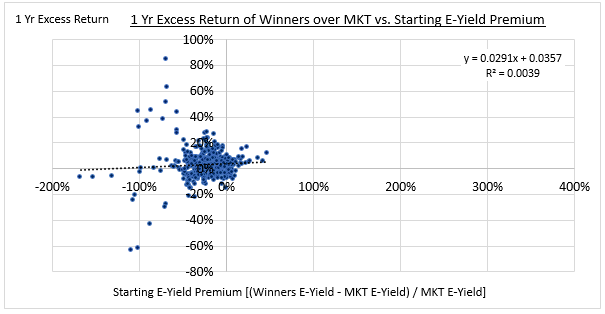
The following charts show the historical relationship between the starting valuations of Winner portfolios relative to Loser portfolios and the subsequent one year excess returns of Winner portfolios:
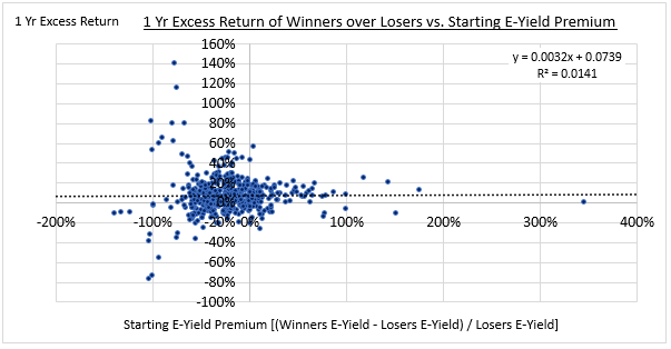
As you can see, there's no relationship. The coefficient of determination (R-squared) is almost exactly 0. We get a similar result when we compare Momentum with the market: Nothing.
We shouldn't be surprised by this result. Momentum is not a Value strategy.
We can summarize our conclusions with respect to the Momentum factor as follows:
- The Momentum factor selects out companies with exceptionally high upcoming near-term fundamental growth.
- Momentum is a divergent process in which these high-growth companies, which tend to either be fairly valued or overvalued at portfolio formation, become more overvalued. The increase in the overvaluation produces an excess return for present Momentum investors, as well as losses for those future investors who buy from present Momentum investors.
- Momentum and Value profit from overreactions to opposite fundamental processes that take place at opposite ends of the holding period, a fact that helps explain why they make good portfolio complements for each other.
- The size of the trailing valuation difference between the Momentum factor and the market bears no relationship to subsequent excess returns for the factor. Momentum is not a Value strategy.
Conclusion
When a sophisticated asset allocator sits down with a money manager, the most common question is "what is your edge?" Any edge must come down to the ability to identify stocks with attractive expected returns, long or short. Sometimes, a single trade can make a career, because the excess returns ended up being strong, and the bet placed was sufficiently large. But there is no way to know ahead of time which managers will succeed in that kind of bet.
Magnitude is great, but consistency is easier to underwrite. Value and Momentum strategies have had an "edge" historically, and we've shown the source of each—one a process of convergence on fair value (value) and the other an end-of-cycle divergence (momentum). In each case, the process is deeply entwined in the market's overall activity and the way that it prices securities. The two strategies work in near opposite ways, but they both have allowed disciplined investors to consistently extract profits from mistakes that the market makes.
Of course, the future is far more interesting and important than the past. To what degree can we be confident that these forms of "edge" will persist? It 's impossible to say with certainty. All we can do is go off of the evidence, which in this case provides strong support for the efficacy of the factors. We find no evidence that the strategies have been "arbitraged away," only that value stocks in the recent period have indeed been traps, generating poor future fundamental growth.
Our goal in this paper was to pick apart the two most common and simple factor approaches, Value and Momentum, defined in terms of the earnings yield and the 6-month trailing return, respectively. In future pieces, we intend to use our new toolkit to illustrate the many ways in which their underlying signals can be improved, in ways that we've been using in live portfolios for more than 20 years. Examples of the kinds of improvements that are possible include: refining the definitions of the factors, using quality screens to avoid companies with poor "holding" growth, and selecting for companies with disciplined capital allocation practices via shareholder yield and other factors. We will also continue to explore the effects that portfolio concentration, risk management, and rebalancing have on factor strategies through time.
Knowing that something works is different from seeing exactly how it works. We hope that you've found our descriptions of how Value and Momentum work to be interesting and helpful as you think about your own investment process or allocations. Generating alpha has never been easy and will never be easy. Discipline, a deep understanding of process and repeatability, and a commitment to evolution are key. You should demand each from every investor managing money on your behalf.
Appendices
Footnotes
1 We can represent returns in terms of whatever sources we want, provided that they stand in the correct mathematical relationship to each other.
2 This result is not really a surprise. Whenever the returns of an investment strategy are analyzed over very long time horizons, the one-off effects of changes in valuation and profitability get distributed out over longer periods of time, shrinking their impacts in annualized terms and causing growth and income, which influence returns in every period, to become the dominant sources. The S&P 500's valuation has doubled since its inception in 1957, for example, but when spread out over 61 years, that doubling amounts to only a small annualized change, on the order of around 1% per year.
3 When choosing which valuation measure to use in a Value strategy, we face a dilemma. On one hand, we want to choose a measure that is based on a fundamental that represents real shareholder value. Earnings and cash flow score well in that respect; sales and book value do not. On the other hand, we want to choose a measure that is based on a fundamental that isn't prone to being artificially overstated (for example, by one-time items). This is important because we need to protect the strategy from adverse selection. Almost by definition, any measure that we use is going to select for any companies whose valuations have ended up artificially overstated on that measure, when those companies aren't genuine "Value" companies. The dilemma, of course, is that measures that represent real shareholder value--e.g., earnings and cash flow--tend to be more vulnerable to overstatement. To keep things simple, we're going to focus on earnings and use the PE ratio as our valuation measure. But in practice, the better way to build a Value portfolio is to use a collection of independently strong valuation measures together, with each measure protecting against overstatement in the others. That's the approach that we use at our firm.
4 Falling earnings and rising PE multiples are mathematically related to each other--at constant prices, one implies the other. The key to understanding how the Value Factor works is to recognize that the gains from multiple expansion tend to be significantly larger than the losses from the falling earnings, leaving the strategy with a strong positive total return on net.
5 As the length of the analysis period is increased, this last source, the unrebalanced valuation change, becomes less impactful. Unlike the other sources, it represents a one-time shift rather than a recurring process. As its effects get spread out over longer periods of time, its contribution in annualized terms falls, particularly in comparison with other sources that are acting continuously throughout the period.
6 In applying this framework, we will sometimes want to say that a strategy outperforms because it generates stronger rebalancing growth or stronger holding growth. Saying this is fine, but we need to be mindful of an important caveat. Rebalancing growth and holding growth are not the literal causes of outperformance. Rather, they are conceptual constructs that allow us to keep track of information that is relevant to diagnosing those causes, information that would otherwise be hidden from the analysis.
To illustrate with an example, suppose that I am a clairvoyant with the ability to identify penny stocks that are about to explode higher in price. I run an investment strategy that consists of a 1% allocation to these penny stocks and a 99% allocation to the S&P 500. Each year, after the penny stock portion of the portfolio explodes higher, I sell it and rebalance the proceeds so as to get the portfolio back to the specified allocation--99% to the S&P 500 and 1% to a new batch of ready-to-explode penny stocks. Obviously, if the penny stock portion of this strategy is working, the strategy will outperform the S&P 500, with the outperformance showing up as excess rebalancing growth. When the penny stocks explode in price, the PE valuation of the overall portfolio will increase, with the increase translating into EPS growth on the rebalancing date when the penny stock proceeds are sold and converted back into earnings-producing S&P 500 shares. But this "rebalancing growth" obviously isn't the actual cause of the strategy's outperformance. The actual cause of the strategy's outperformance is my picking winning penny stocks.
7 Rebalancing growth in an index's fundamentals is usually associated with multiple expansion in the prior holding period, but not always. If the stocks in a cheap quintile Value strategy, for example, stay at the same multiple during a holding period, and stocks in other quintiles become cheaper than those stocks, then the strategy will experience positive rebalancing growth when it rebalances into the new cheaper stocks, even though its multiple did not previously expand. For a characteristic example of this outcome, see the PE and EPS charts from June 1999 to June 2000. The outcome is typically associated with situations in which Value stocks are getting cheaper as a group.
8 In an equally-weighted allocation scheme, this statement isn't exactly correct. An equal-weighted strategy will end up slightly adjusting its allocations in every rebalancing event simply to take all of its positions back to the same size. These adjustments will cause changes to the PE, giving rise to rebalancing growth even in the absence of churn across the quintiles. But the effect will tend to be small.
9 The earnings to EBITDA margin tracks the portion of the decline attributable to falling earnings relative to EBITDA, the EBITDA to sales margin tracks the portion of the decline attributable to falling EBITDA relative to sales, and sales growth tracks the portion of the decline attributable to falling sales. In this way, the decomposition covers the sources of the earnings declines from the top line all the way down to the bottom line.
10 A portion of the earnings declines is likely attributable to artificial accounting events that include: (1) the booking of non-cash writedowns in troubled companies during the holding periods and (2) the "rolling off" of recent one-time gains (e.g., from asset sales or changes in tax provisions) that might have made certain stocks look cheap on trailing income-based measures, drawing them into the factor. With respect to (1), the writedown charges themselves may be artificial, but the conditions that give rise to them are not. They represent further evidence of fundamental weakness in the underlying companies. With respect to (2), we try to minimize these effects by using an income measure that excludes extraordinary items and discontinued operations, but certain types of one-time gains will still get counted on occasion. Regardless, the fact that the weakness is pervasive across all of the fundamental return sources shown above (i.e., sales, EBITDA, earnings) confirms that it's due to much more than just accounting.
11 To understand exactly what's happening in the chart, consider an annually-rebalanced Value Portfolio that is formed on a given date. If we take that date as our reference starting date, we can look out 1, 2, 3, 4..., 118, 119, 120 months (10 years) and calculate the EPS growth of the evolving portfolio up to each of those forward-looking points in time. To generate the chart, we run these calculations on all portfolios formed between December 1963 and October 2007. We then average their growth rates at each forward-looking point together, forming an "average" portfolio with average growth numbers for each month out to 10 years. The results are winsorized to 2.5% and then plotted in the chart.
12 As a disclaimer, these average charts are better used to confirm and convey general patterns and insights that are already well-supported by other evidence. When used in isolation to make precise claims about how a strategy works, they tend to be less reliable. Averages, after all, are abstractions that do not exist in any actual part of the data.
13 The earnings streams shown in these charts include reinvested dividends. When the streams are priced cheaply in the market, the dividends get reinvested at better prices and rates of return, increasing the growth. The Value factor's eventual growth convergence with the market could very well be partially dependent on this phenomenon. That is, the lower valuations that Value trades at could be fueling some of the extra growth that brings it into eventual growth parity with the market. If that's the case, then the streams should not trade at the same valuation at equilibrium--the Value stream should trade more cheaply.
14 Because the yield is being measured at all times against a constant future earnings number, i.e., the earnings in year 10, the compression in the yield premium is a direct mathematical proxy for the price outperformance of the strategy.
15 To be fair, differences in the future yields could be justified by expectations of growth differentials that will ensue in the portfolios beyond the 10 year point. The market evidently believes there to be a future growth differential beyond that point because it never fully converges the yields. But the fact that the yields converge to the extent that they do, with the yield premium essentially getting cut in half over the analysis period, is the market's own tacit admission that it was pricing Value too pessimistically, even with differences in expected growth rates past year 10 considered.
16 These numbers do not include the effects of recent corporate tax changes, which may benefit the earnings of Value stocks more than the earnings of Growth stocks.
17 The concept of "momentum reversal" is attributable to Narasimhan Jegadeesh and Sheridan Titman. For more information, see their 2001 paper, "Profitability of Momentum Strategies: An Evaluation of Alternative Explanations."
GENERAL LEGAL DISCLOSURES & HYPOTHETICAL AND/OR BACKTESTED RESULTS DISCLAIMER
The material contained herein is intended as a general market commentary. Opinions expressed herein are solely those of O'Shaughnessy Asset Management, LLC and may differ from those of your broker or investment firm.
Please remember that past performance may not be indicative of future results. Different types of investments involve varying degrees of risk, and there can be no assurance that the future performance of any specific investment, investment strategy, or product (including the investments and/or investment strategies recommended or undertaken by O'Shaughnessy Asset Management, LLC), or any non-investment related content, made reference to directly or indirectly in this piece will be profitable, equal any corresponding indicated historical performance level(s), be suitable for your portfolio or individual situation, or prove successful. Due to various factors, including changing market conditions and/or applicable laws, the content may no longer be reflective of current opinions or positions. Moreover, you should not assume that any discussion or information contained in this piece serves as the receipt of, or as a substitute for, personalized investment advice from O'Shaughnessy Asset Management, LLC. Any individual account performance information reflects the reinvestment of dividends (to the extent applicable), and is net of applicable transaction fees, O'Shaughnessy Asset Management, LLC's investment management fee (if debited directly from the account), and any other related account expenses. Account information has been compiled solely by O'Shaughnessy Asset Management, LLC, has not been independently verified, and does not reflect the impact of taxes on non-qualified accounts. In preparing this report, O'Shaughnessy Asset Management, LLC has relied upon information provided by the account custodian. Please defer to formal tax documents received from the account custodian for cost basis and tax reporting purposes. Please remember to contact O'Shaughnessy Asset Management, LLC, in writing, if there are any changes in your personal/financial situation or investment objectives for the purpose of reviewing/evaluating/revising our previous recommendations and/or services, or if you want to impose, add, or modify any reasonable restrictions to our investment advisory services. Please Note: Unless you advise, in writing, to the contrary, we will assume that there are no restrictions on our services, other than to manage the account in accordance with your designated investment objective. Please Also Note: Please compare this statement with account statements received from the account custodian. The account custodian does not verify the accuracy of the advisory fee calculation. Please advise us if you have not been receiving monthly statements from the account custodian. Historical performance results for investment indices and/or categories have been provided for general comparison purposes only, and generally do not reflect the deduction of transaction and/or custodial charges, the deduction of an investment management fee, nor the impact of taxes, the incurrence of which would have the effect of decreasing historical performance results. It should not be assumed that your account holdings correspond directly to any comparative indices. To the extent that a reader has any questions regarding the applicability of any specific issue discussed above to his/her individual situation, he/she is encouraged to consult with the professional advisor of his/her choosing. O'Shaughnessy Asset Management, LLC is neither a law firm nor a certified public accounting firm and no portion of the newsletter content should be construed as legal or accounting advice. A copy of the O'Shaughnessy Asset Management, LLC's current written disclosure statement discussing our advisory services and fees is available upon request
The risk-free rate used in the calculation of Sortino, Sharpe, and Treynor ratios is 5%, consistently applied across time
The universe of All Stocks consists of all securities in the Chicago Research in Security Prices (CRSP) dataset or S&P Compustat Database (or other, as noted) with inflation-adjusted market capitalization greater than $200 million as of most recent year-end. The universe of Large Stocks consists of all securities in the Chicago Research in Security Prices (CRSP) dataset or S&P Compustat Database (or other, as noted) with inflation-adjusted market capitalization greater than the universe average as of most recent year-end. The stocks are equally weighted and generally rebalanced annually
Hypothetical performance results shown on the preceding pages are backtested and do not represent the performance of any account managed by OSAM, but were achieved by means of the retroactive application of each of the previously referenced models, certain aspects of which may have been designed with the benefit of hindsight
The hypothetical backtested performance does not represent the results of actual trading using client assets nor decision-making during the period and does not and is not intended to indicate the past performance or future performance of any account or investment strategy managed by OSAM. If actual accounts had been managed throughout the period, ongoing research might have resulted in changes to the strategy which might have altered returns. The performance of any account or investment strategy managed by OSAM will differ from the hypothetical backtested performance results for each factor shown herein for a number of reasons, including without limitation the following:
- Although OSAM may consider from time to time one or more of the factors noted herein in managing any account, it may not consider all or any of such factors. OSAM may (and will) from time to time consider factors in addition to those noted herein in managing any account.
- OSAM may rebalance an account more frequently or less frequently than annually and at times other than presented herein.
- OSAM may from time to time manage an account by using non-quantitative, subjective investment management methodologies in conjunction with the application of factors.
- The hypothetical backtested performance results assume full investment, whereas an account managed by OSAM may have a positive cash position upon rebalance. Had the hypothetical backtested performance results included a positive cash position, the results would have been different and generally would have been lower.
- The hypothetical backtested performance results for each factor do not reflect any transaction costs of buying and selling securities, investment management fees (including without limitation management fees and performance fees), custody and other costs, or taxes – all of which would be incurred by an investor in any account managed by OSAM. If such costs and fees were reflected, the hypothetical backtested performance results would be lower.
- The hypothetical performance does not reflect the reinvestment of dividends and distributions therefrom, interest, capital gains and withholding taxes.
- Accounts managed by OSAM are subject to additions and redemptions of assets under management, which may positively or negatively affect performance depending generally upon the timing of such events in relation to the market's direction.
- Simulated returns may be dependent on the market and economic conditions that existed during the period. Future market or economic conditions can adversely affect the returns.