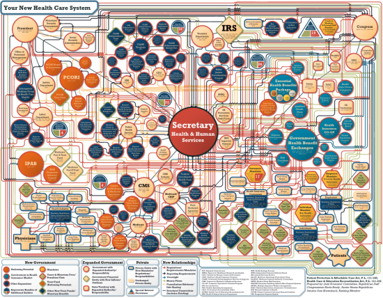
Charles Blow on this unnecessarily complex chart used to show the network of Obamacare:
Maybe it's the former graphics/art director in me, but I get really offended when people use charts to confuse rather than to clarify.
Take a look at this monstrosity released today by the Joint Economic Committee minority, which is led by Senator Sam Brownback (R-Kansas) and Representative Kevin Brady (R-Texas).
To paraphrase one of my favorite quotes: they’re using this chart like a drunken man uses lampposts – for support rather than for illumination.
Really, Joint Economic Committee? Look - I'm not going to pretend I know all the intricacies of the US health care system, but this is clearly chart abuse.
Looking at this horribly designed piece of propaganda makes me want to throw up. I'm throwing up right now. Dang it. Someone owes me a new keyboard.


No comments:
Post a Comment